Dalima Restaurant
Objective:
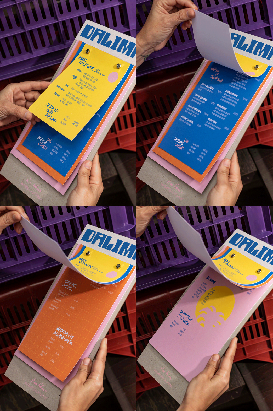
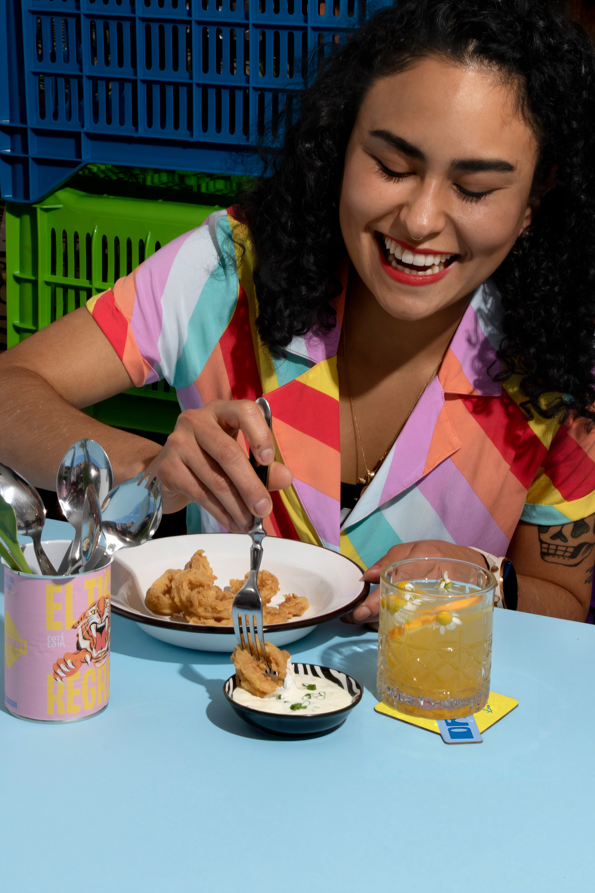
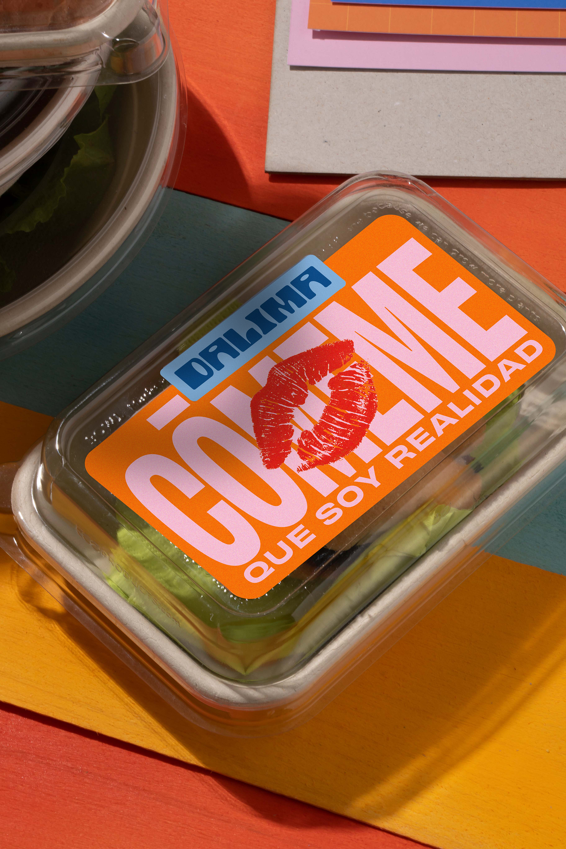
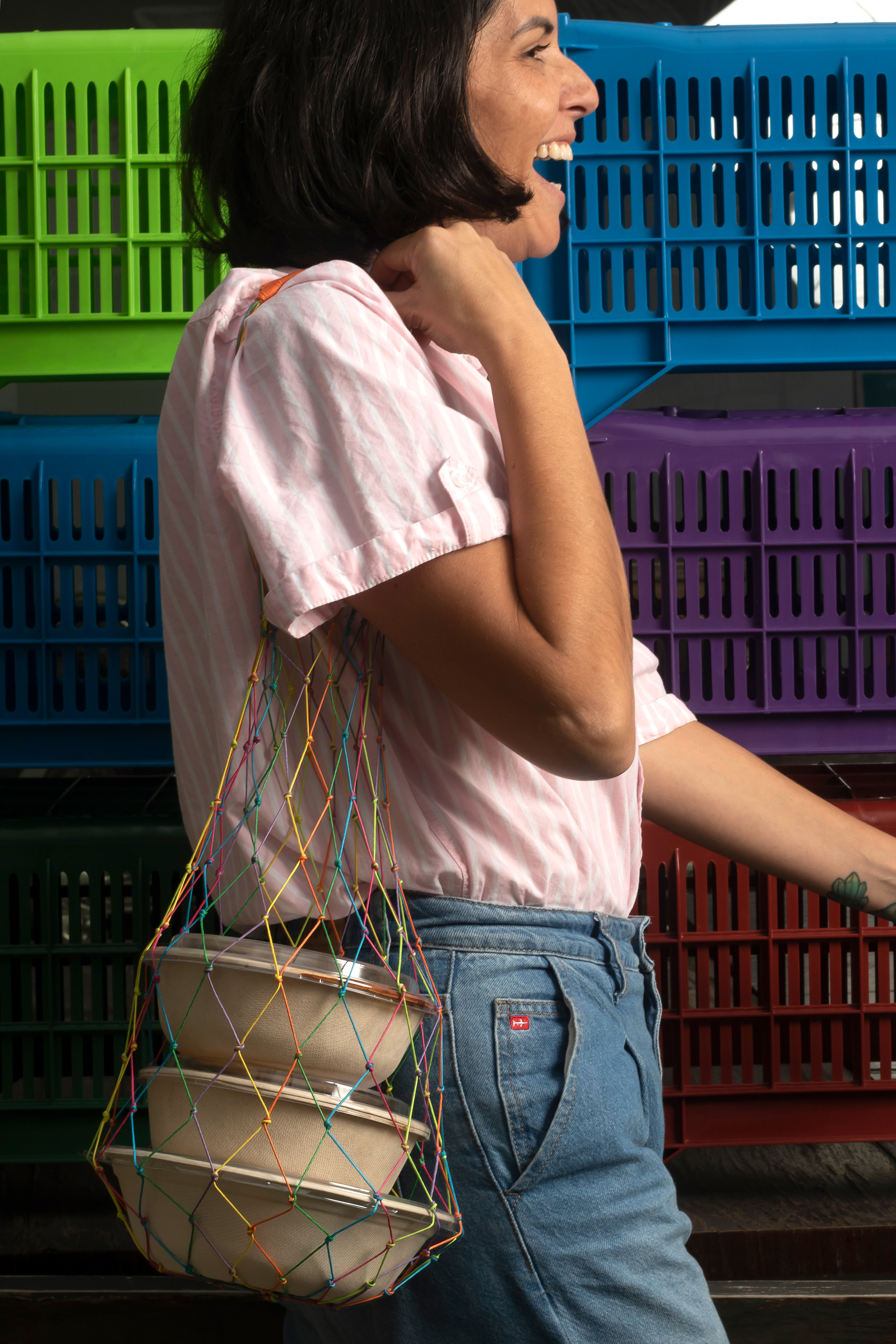
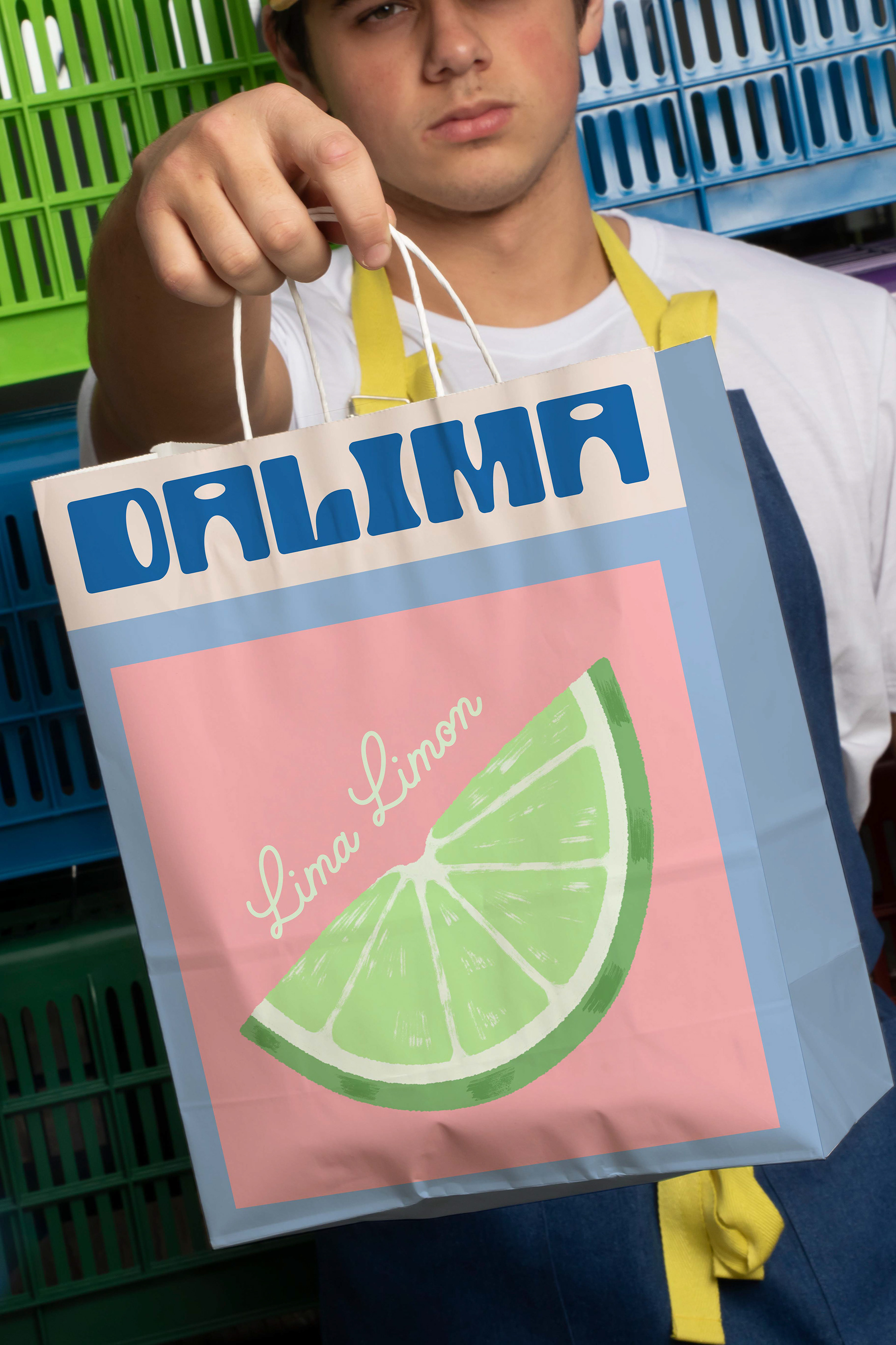
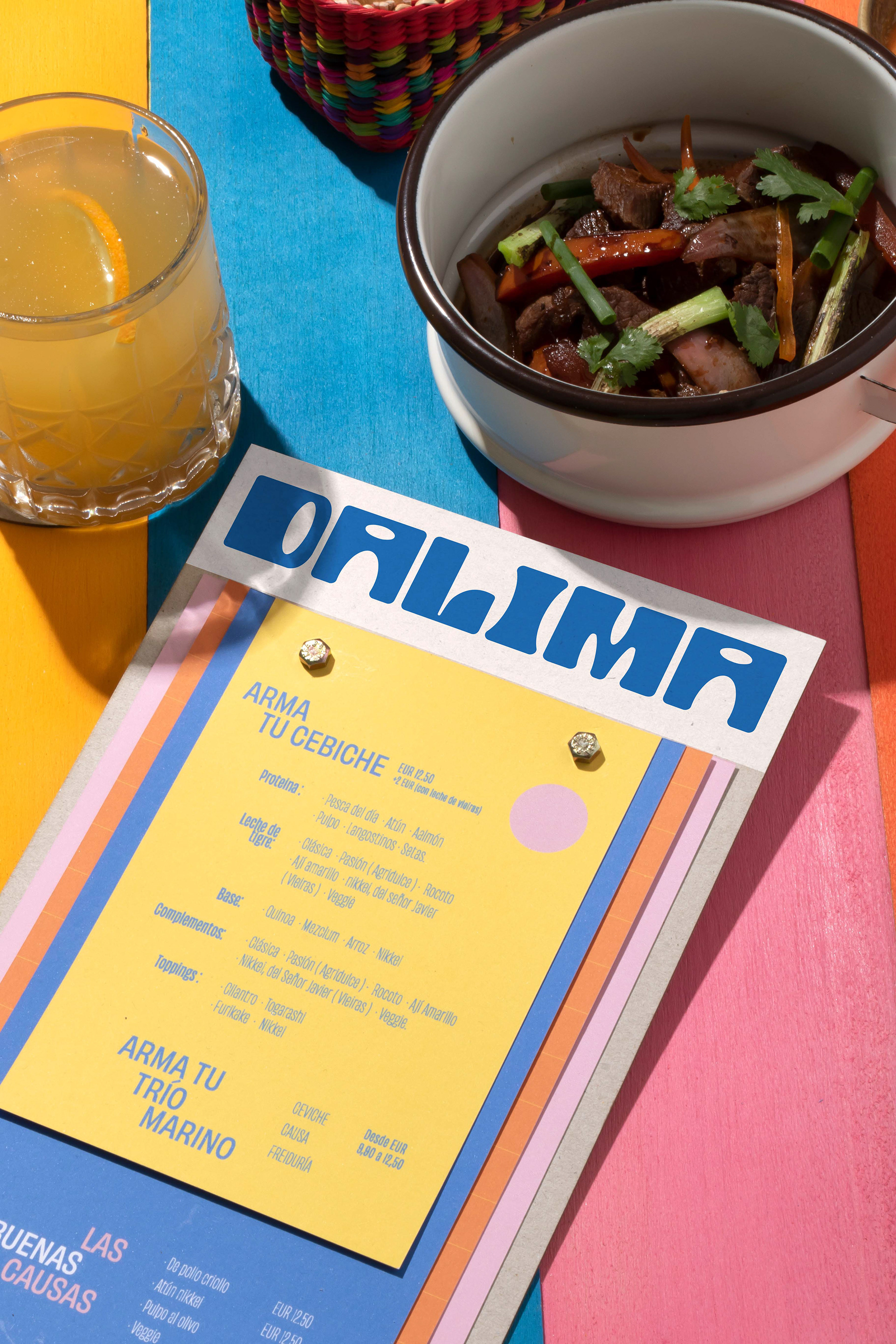
The objective was to develop an identity that reflected it was a Peruvian restaurant in Valencia, but made by Peruvians: that felt authentic but, at the same time, felt close; of quality, but with affordable prices; that had a vibe because they not only wanted to export the experience of Peruvian food but also some of its folklore, mischief, and even its party atmosphere.
Solution:
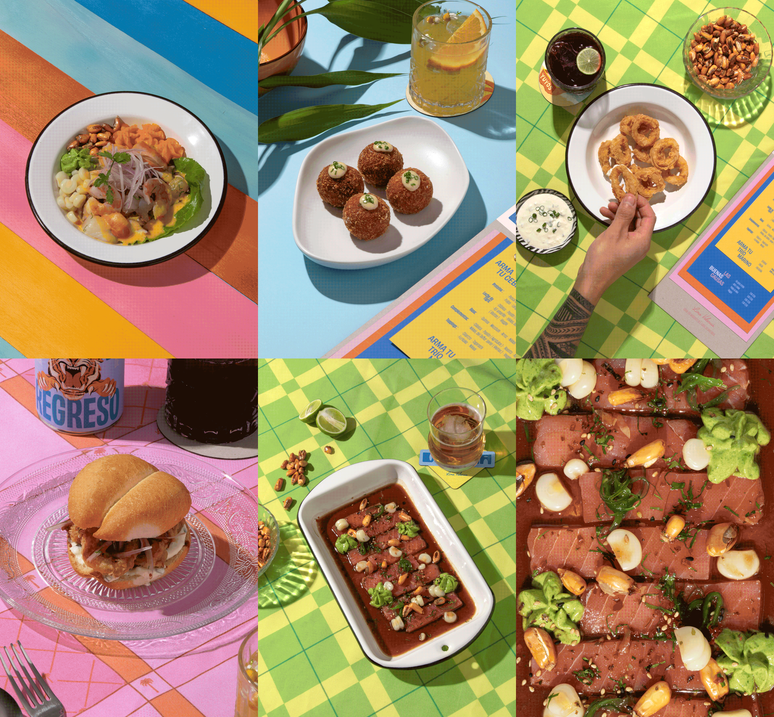
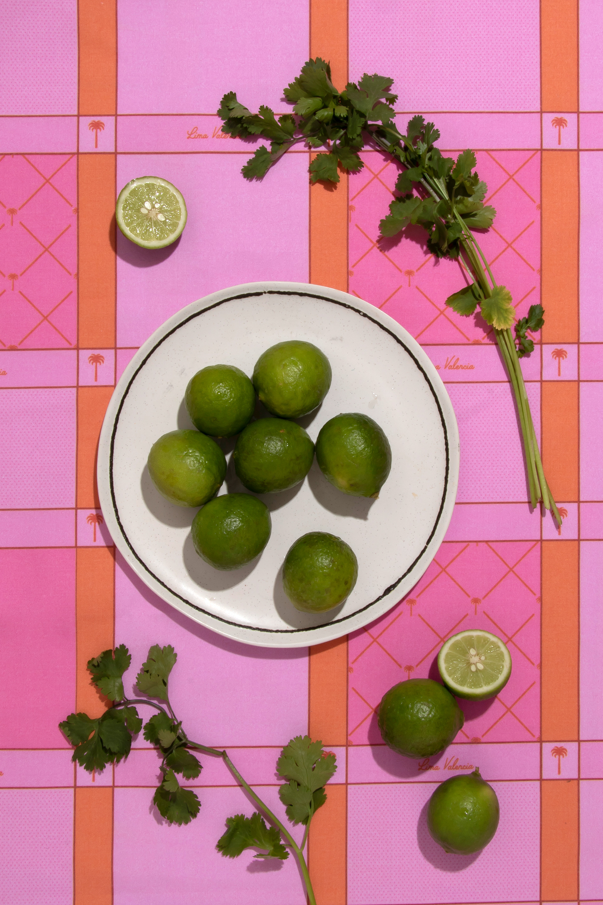
The first thing we did was to study what Lima had in common with Valencia: clearly, the coast, its fishing terminals, and the beaches that, although with a different idiosyncrasy, share several commonalities. That is why we decided to resort to Agua Dulce beach, a very populous one on the same coast of Lima, which reflects much of the popular Lima folklore: bright colors, witty and mischievous phrases, drawn typography, and "leche de tigre" (tiger's milk) in a wheelbarrow.
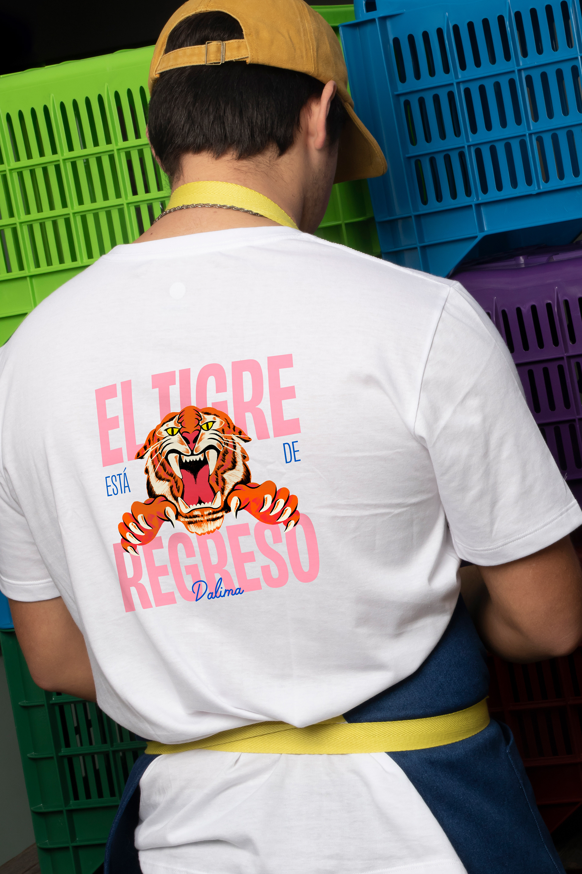
Regarding the main illustration of the brand, it is worth noting that although the tiger is not native to Peru, we found it in many popular expressions, such as on the backs of interprovincial trucks, or in the phrase "es un tigre" (he/she is a tiger) when referring to someone with skill.
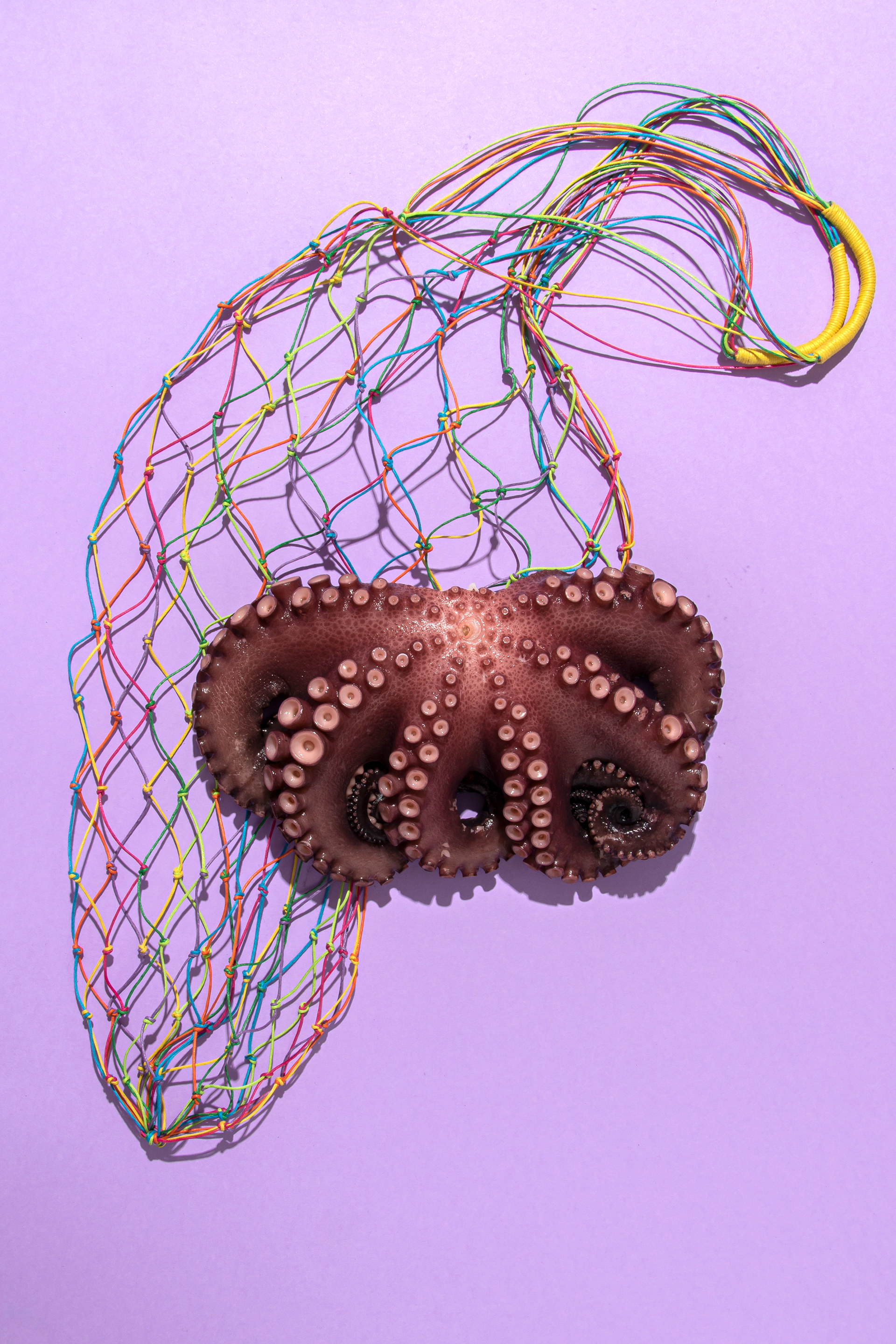
Therefore, this identity has, among other things, an irreverent and picturesque photographic language and the illustration of a tiger with the phrase "El tigre está de regreso" (the tiger is back).
FIBRA
BRANDING & PACKAGING @
@fibra_branding



STUDIO: FIBRA BRANDING
IG: @fibra_branding
CREATIVE & ART DIRECTION: Andrea Gálvez
GRAPHIC DESIGN: Andrea Gálvez, Daniela Barrio de Mendoza
ILLUSTRATION : Ricardo Bustamante
PHOTOGRAPHY: Daniela Barrio de Mendoza y Somos Brava
