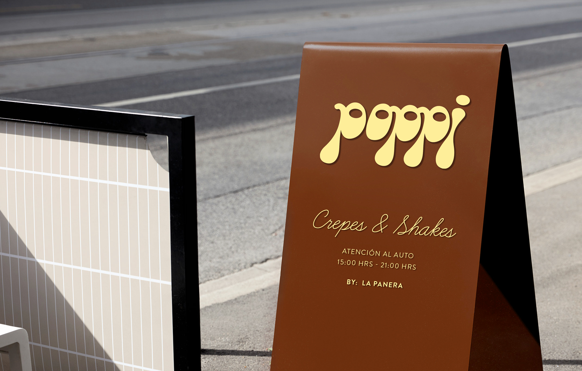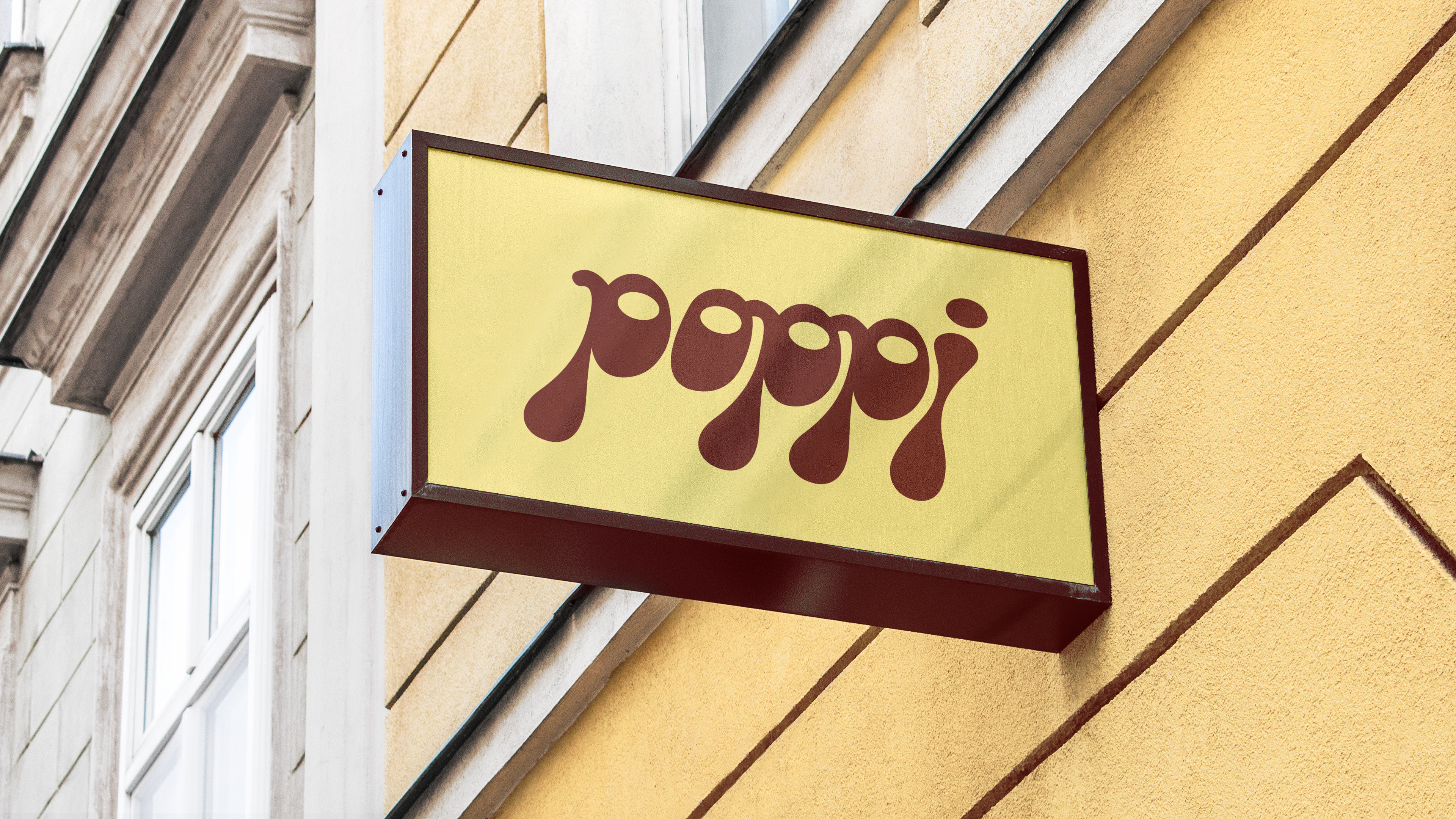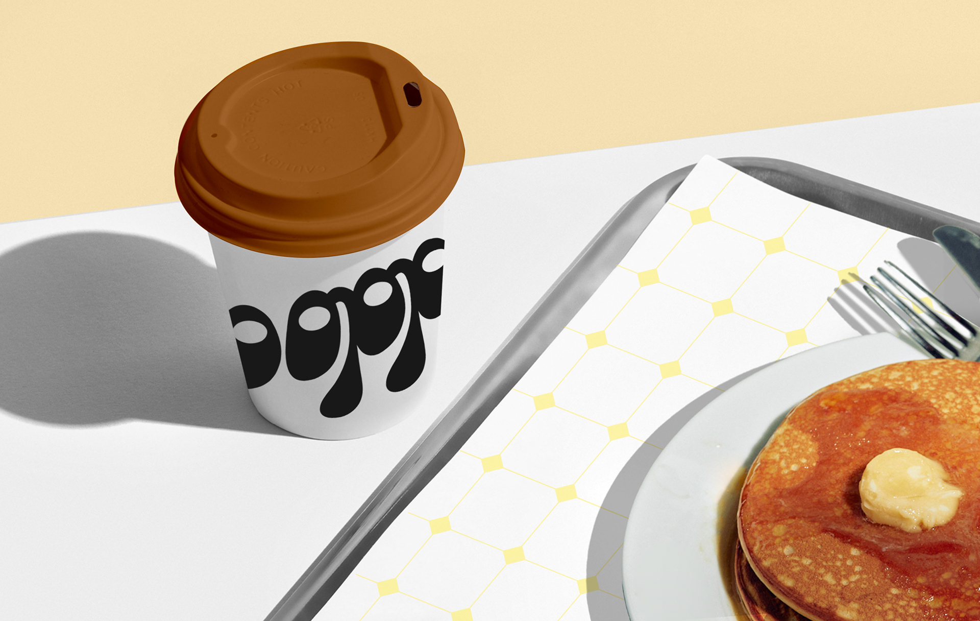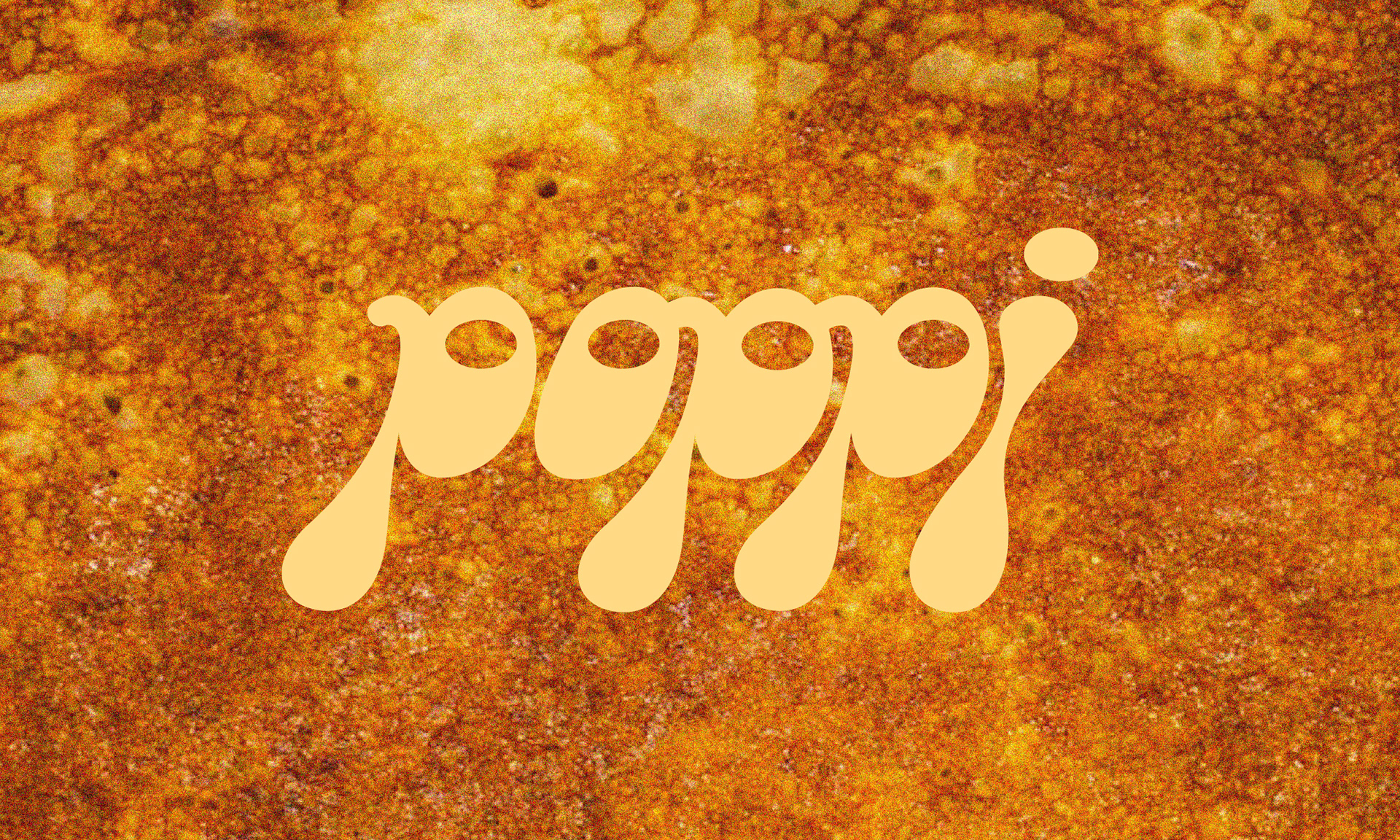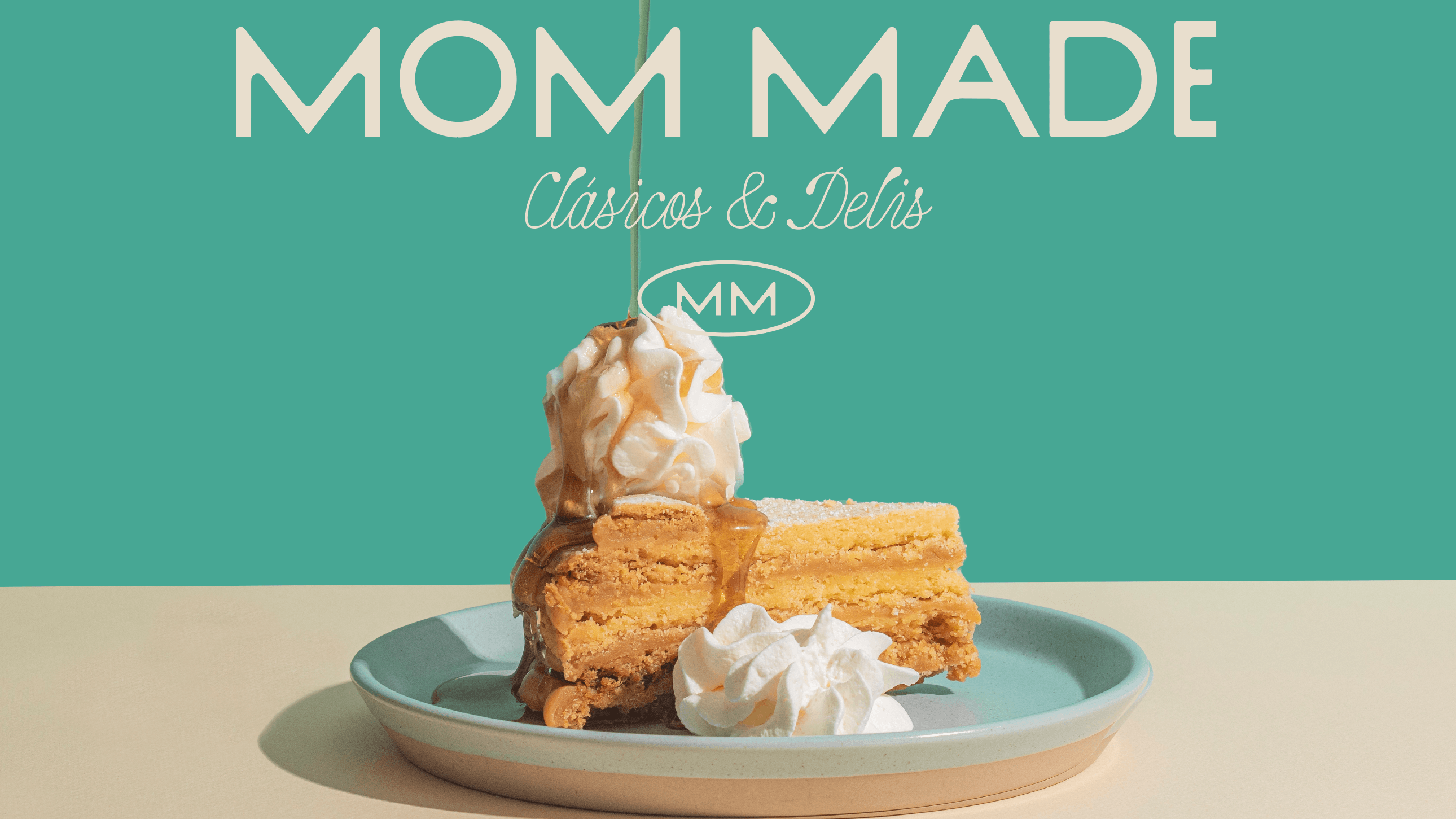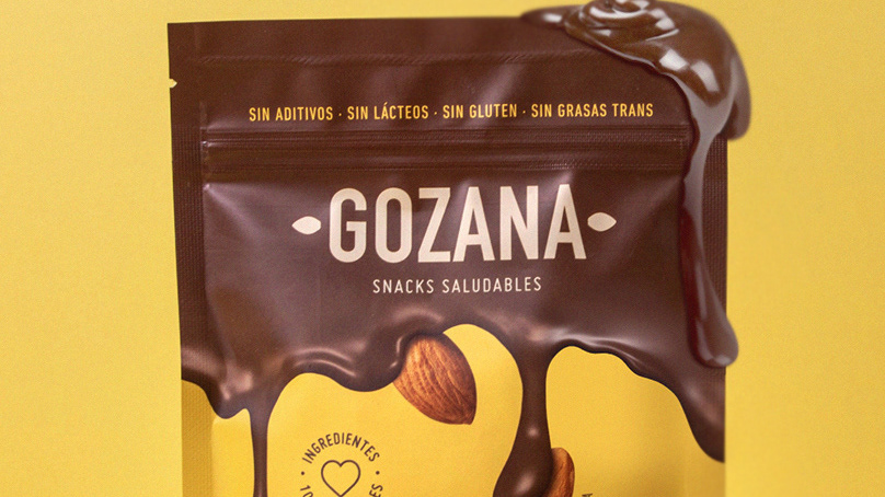

Poppi
Crepes & Waffles
Context:
Our client, La Panera, had developed an ice cream line for which they wanted to create a brand of its own to mainly sell crepes, with the ice cream being the accompaniment. The idea of developing a separate brand emerged just before starting the project; initially, it was going to be called La Panera Crepes & Soft.
Objective:
The objective was to develop a logo for the brand identity that would stand out from the parent brand, La Panera, even though in some cases it would be endorsed by it. Most importantly, the logo had to represent the main product, crepes.
Solution:
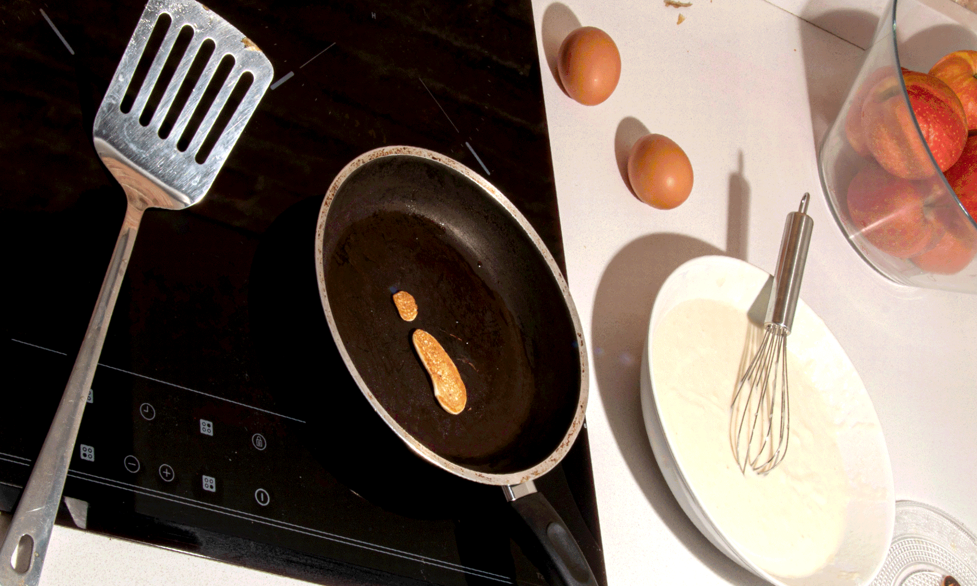
Since the request was to clearly evoke the main product, we physically experimented with crepe batter in a pan, and after several exercises, we were able to satisfactorily draw the word Poppi with mini crepes. The logo maintains yellow colors that also remind us of its batter.
FIBRA
BRANDING & PACKAGING @
@fibra_branding