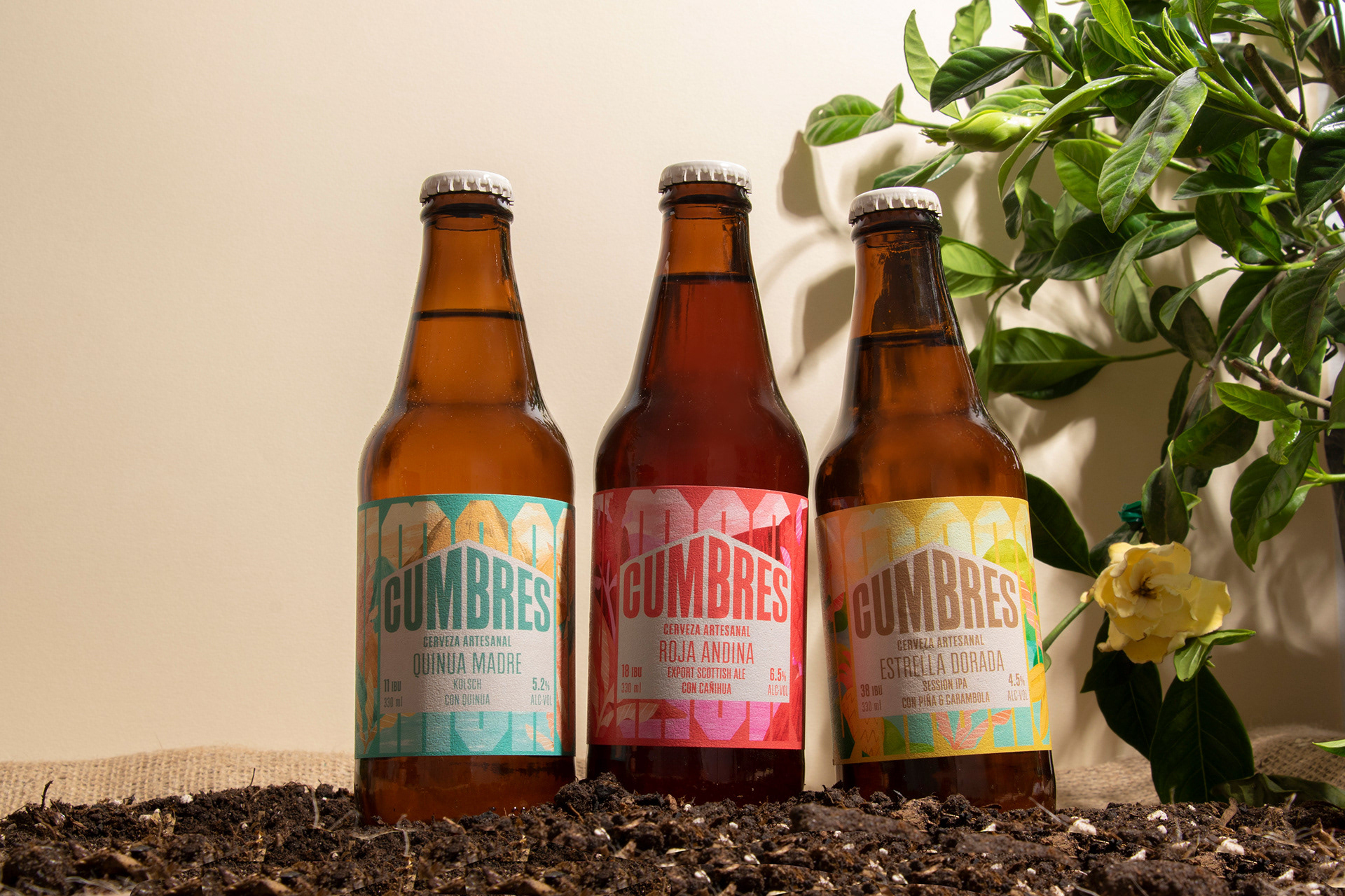
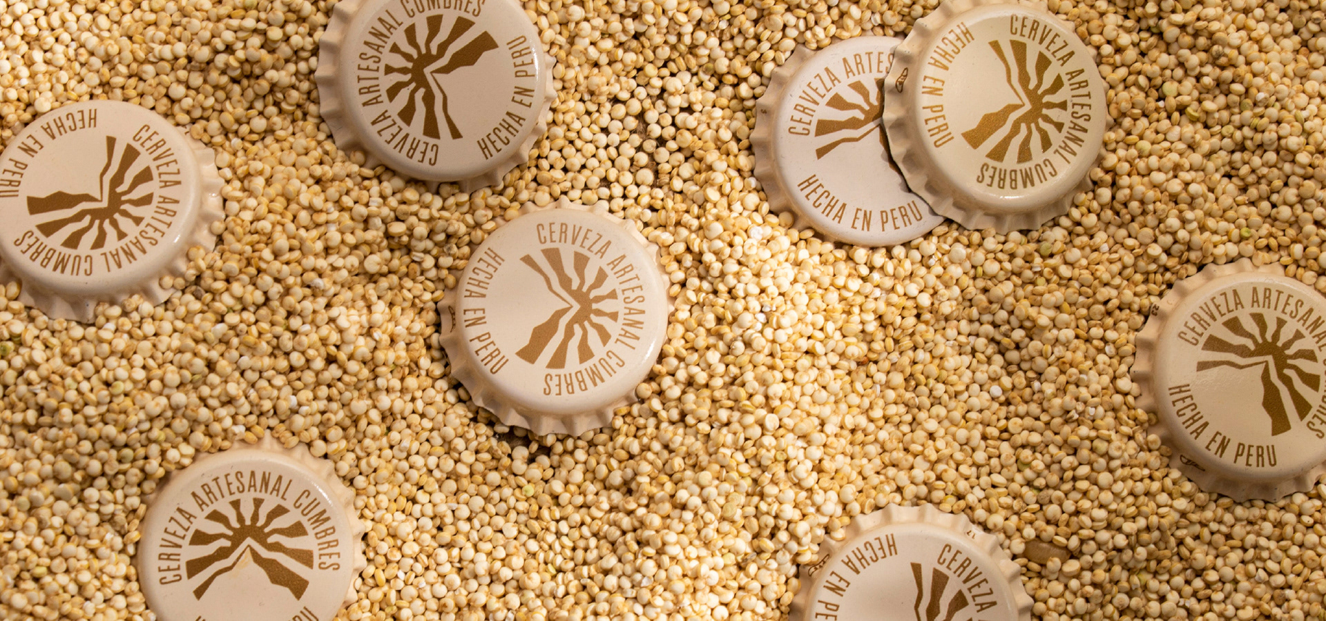
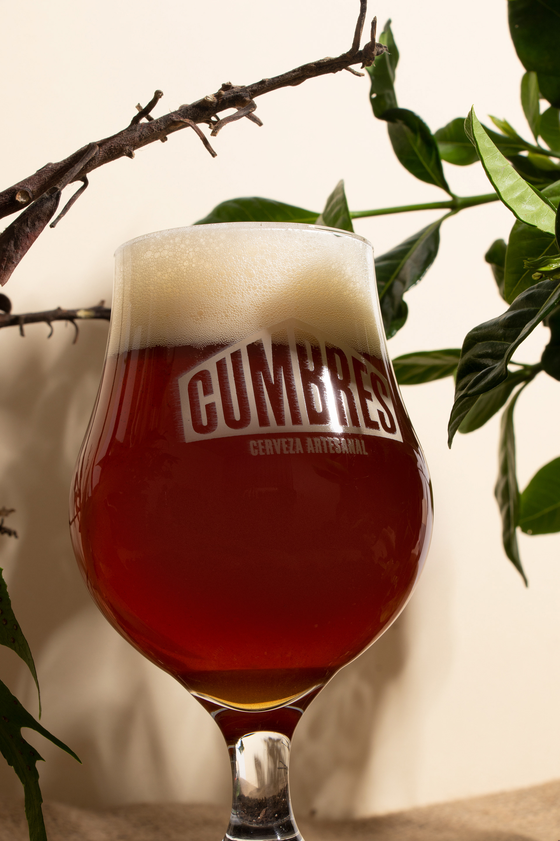
Cumbres
Context:
The world of craft beer in Peru has grown tremendously in recent years. Every new brand that emerges is more eye-catching than the last, all striving to stand out on the shelf, and very few hit the market without a competitive label. However, some of the pioneering beers have yet to update their identity to reflect the current context.
Objective:
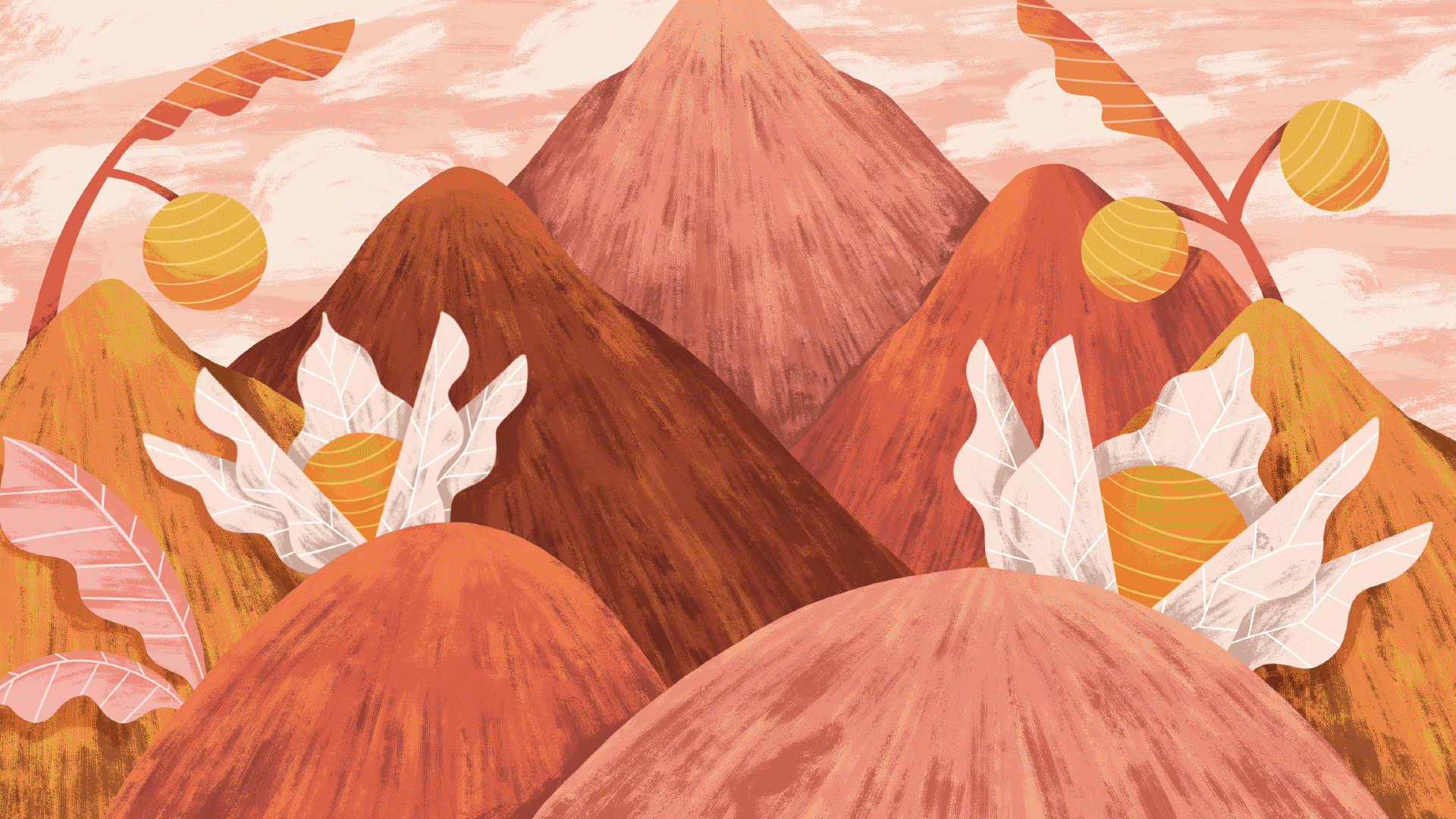
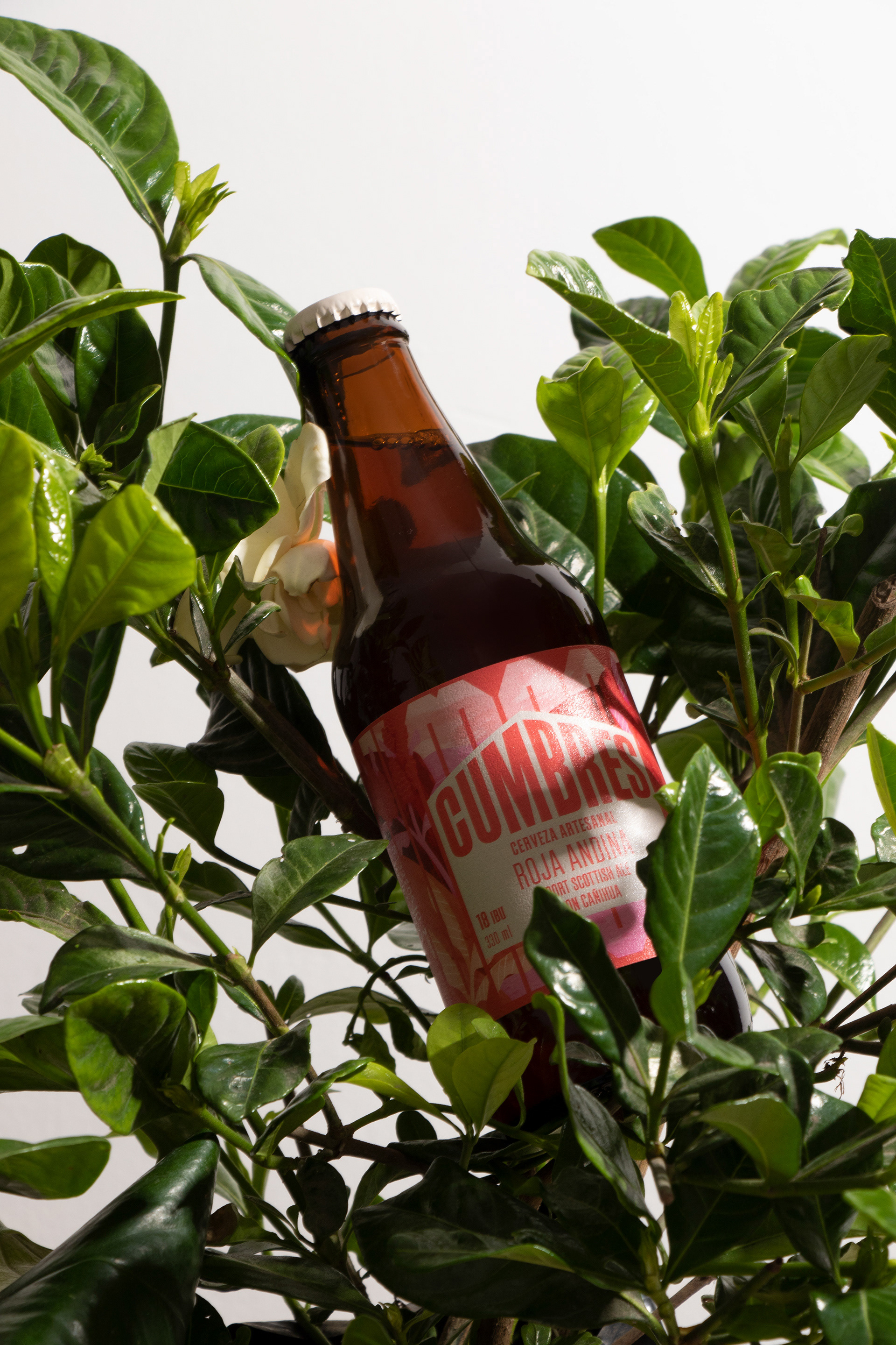
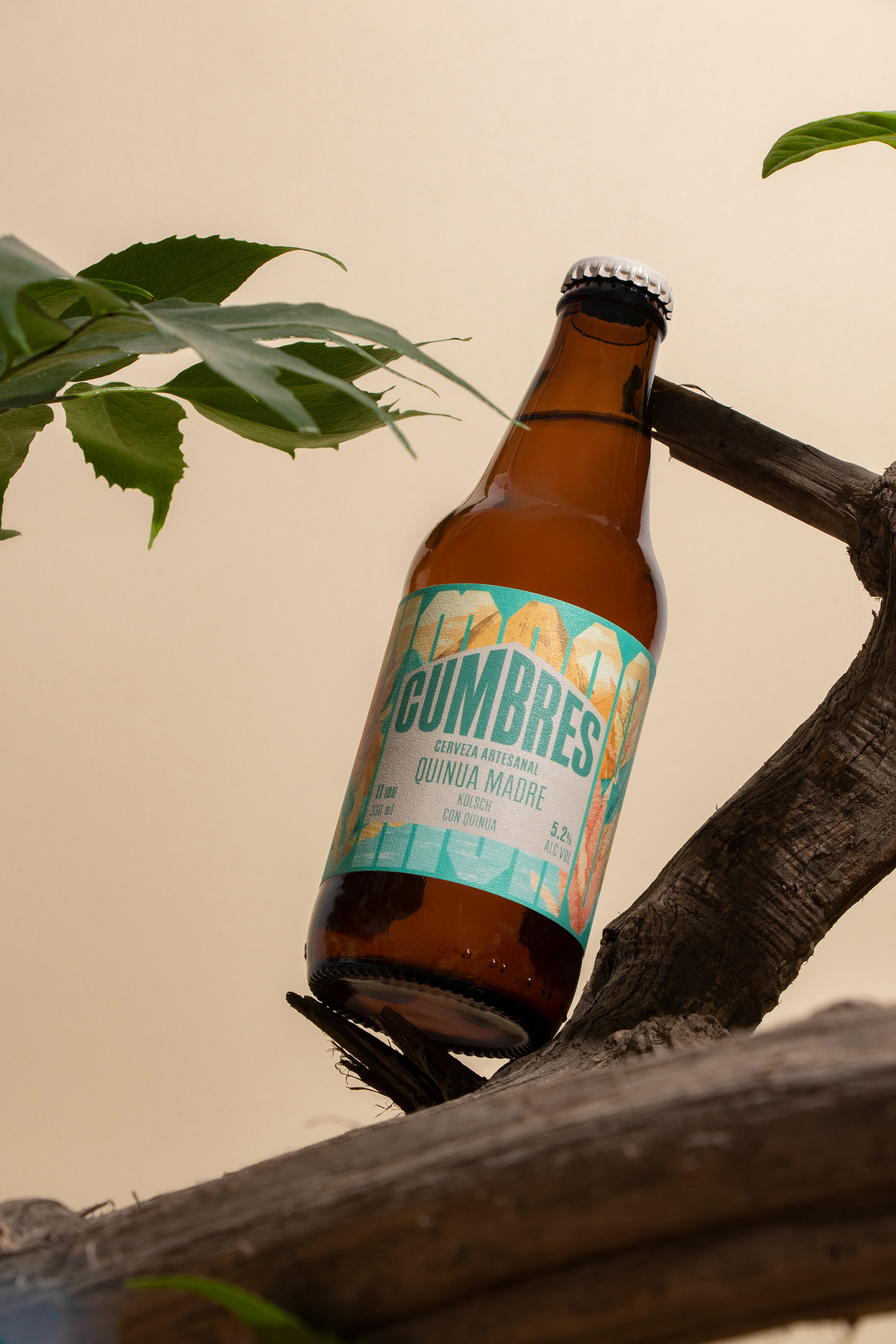
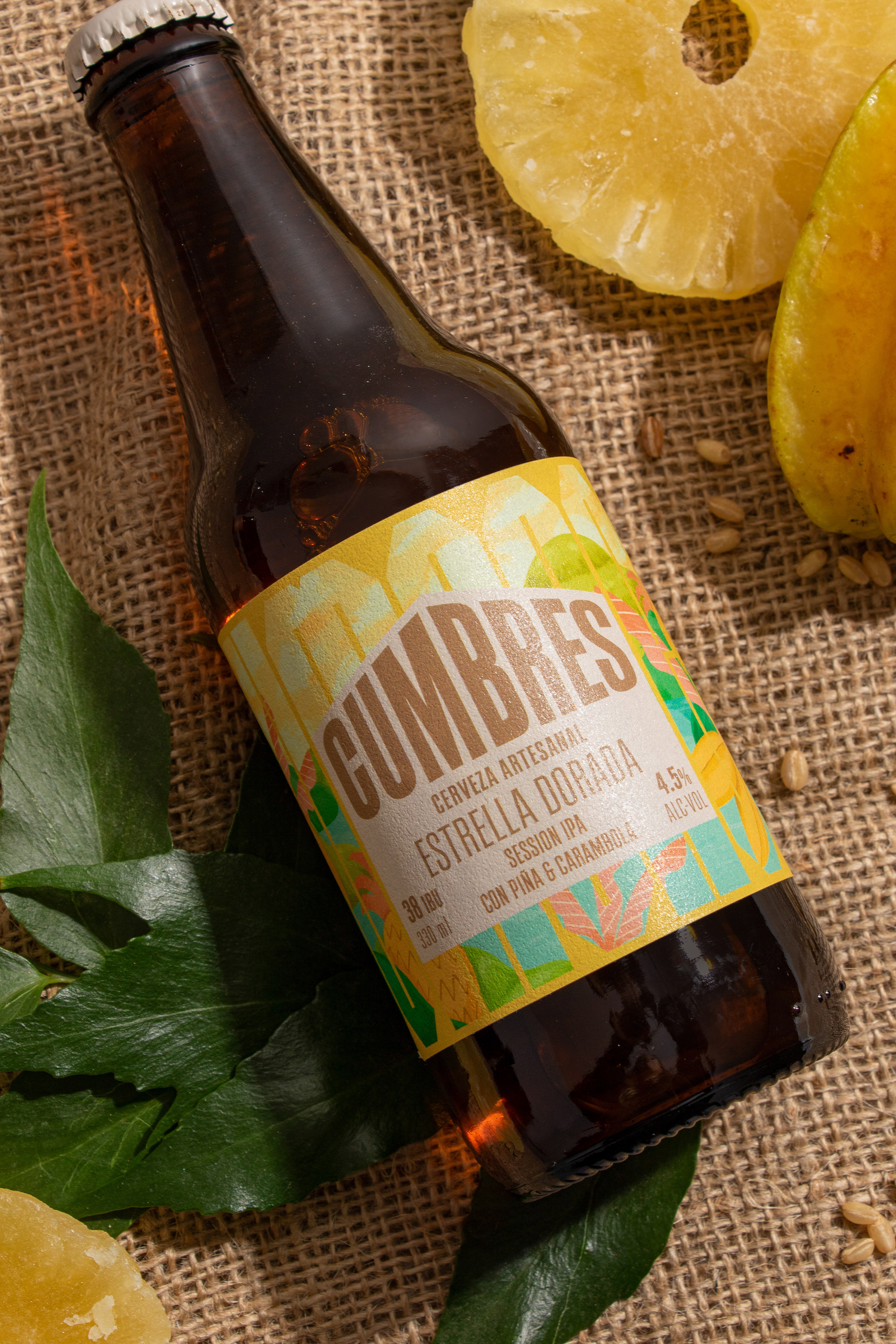
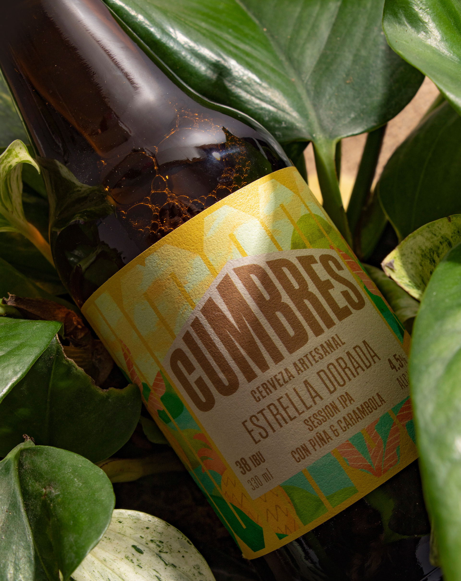
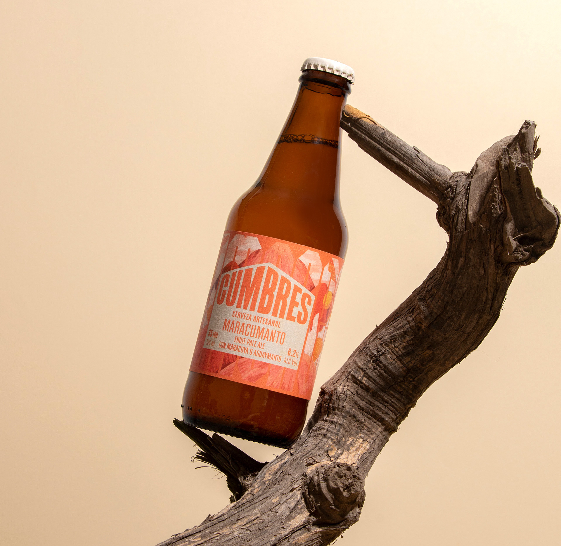
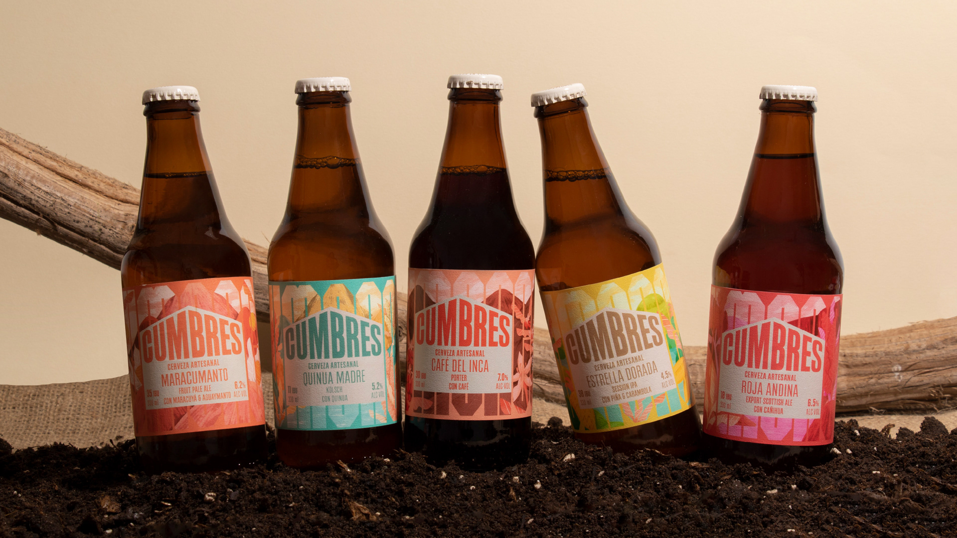
Cumbres comes to the studio for a rebranding. It is one of the 3 pioneering craft beers in Peru, and its identity has been stagnant. They asked us to modernize their brand while representing its essence, which is the spirit of rustic and natural, of the contact with the land from which the ingredients come from, and the Peruvian peaks.
Solution:
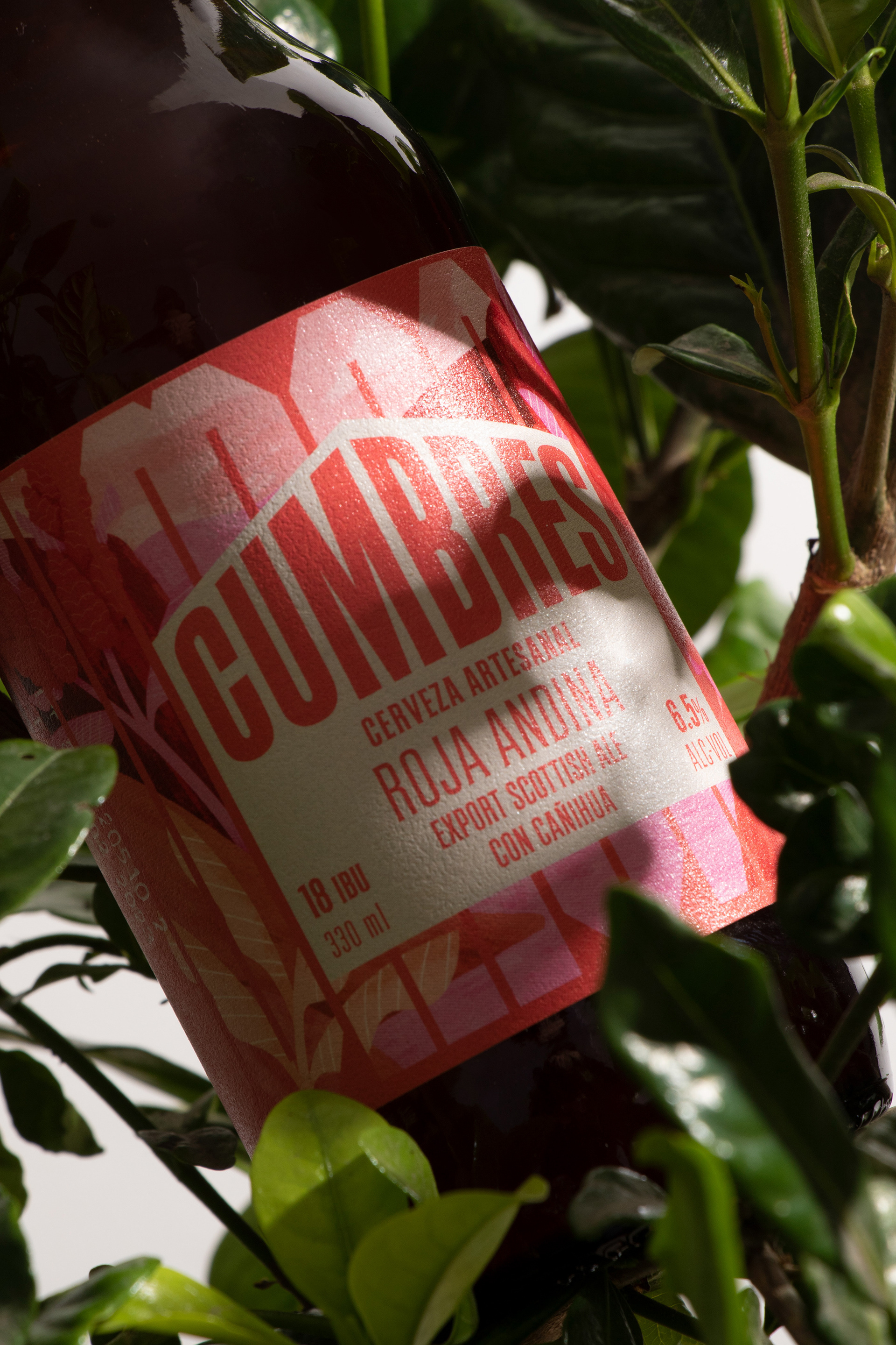
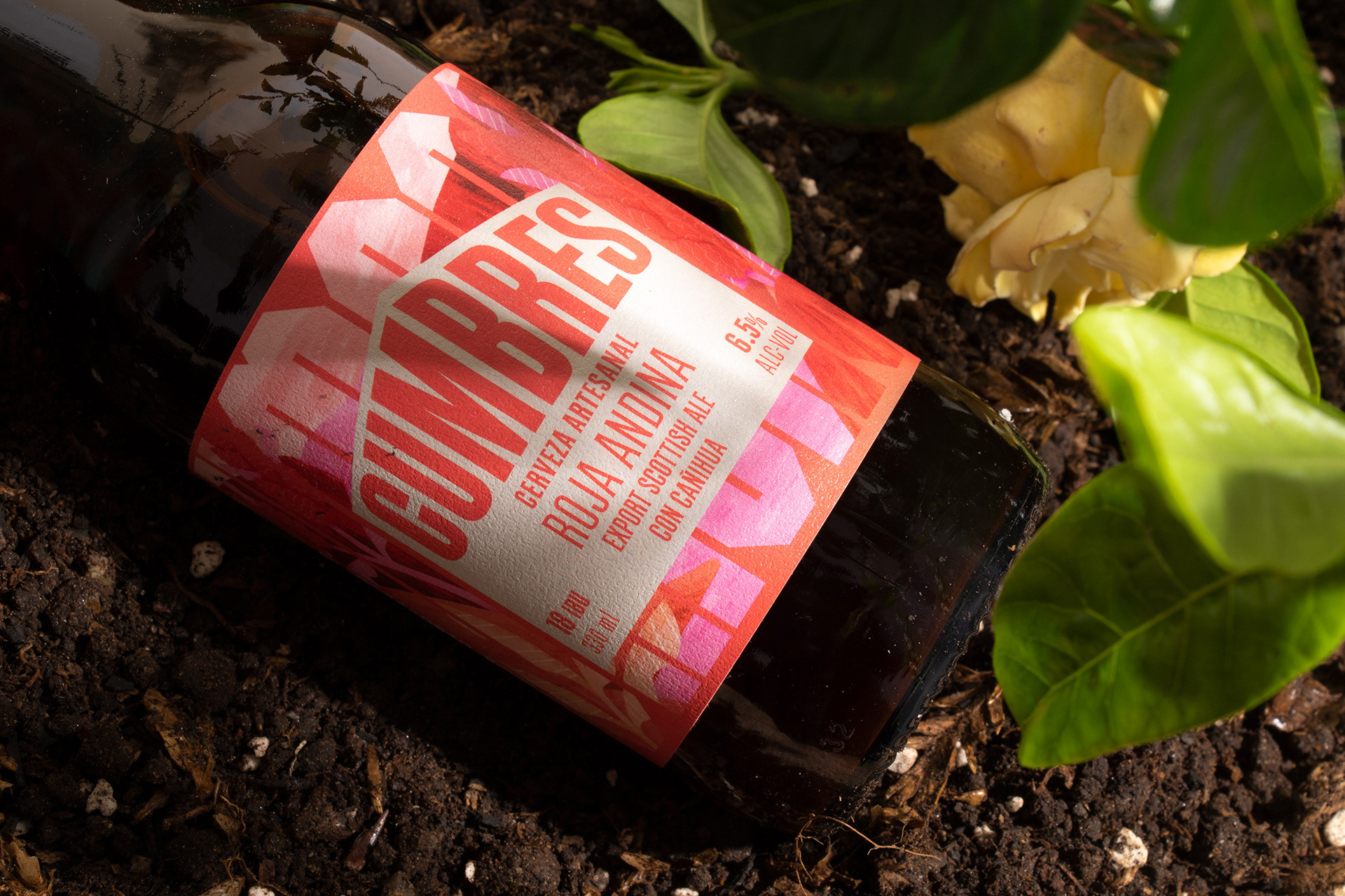
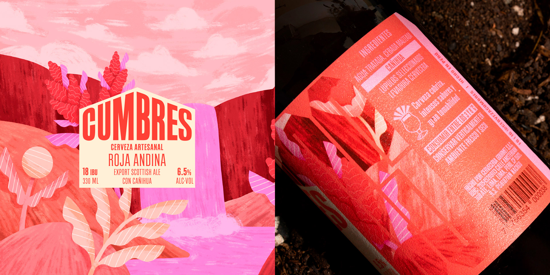
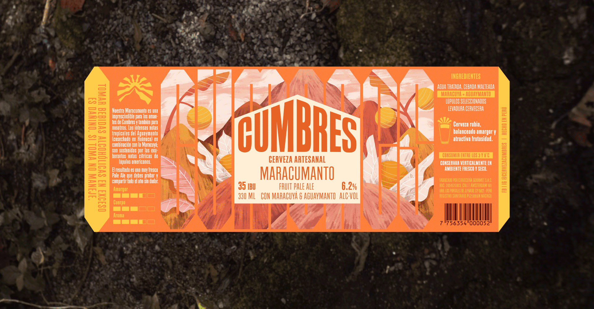
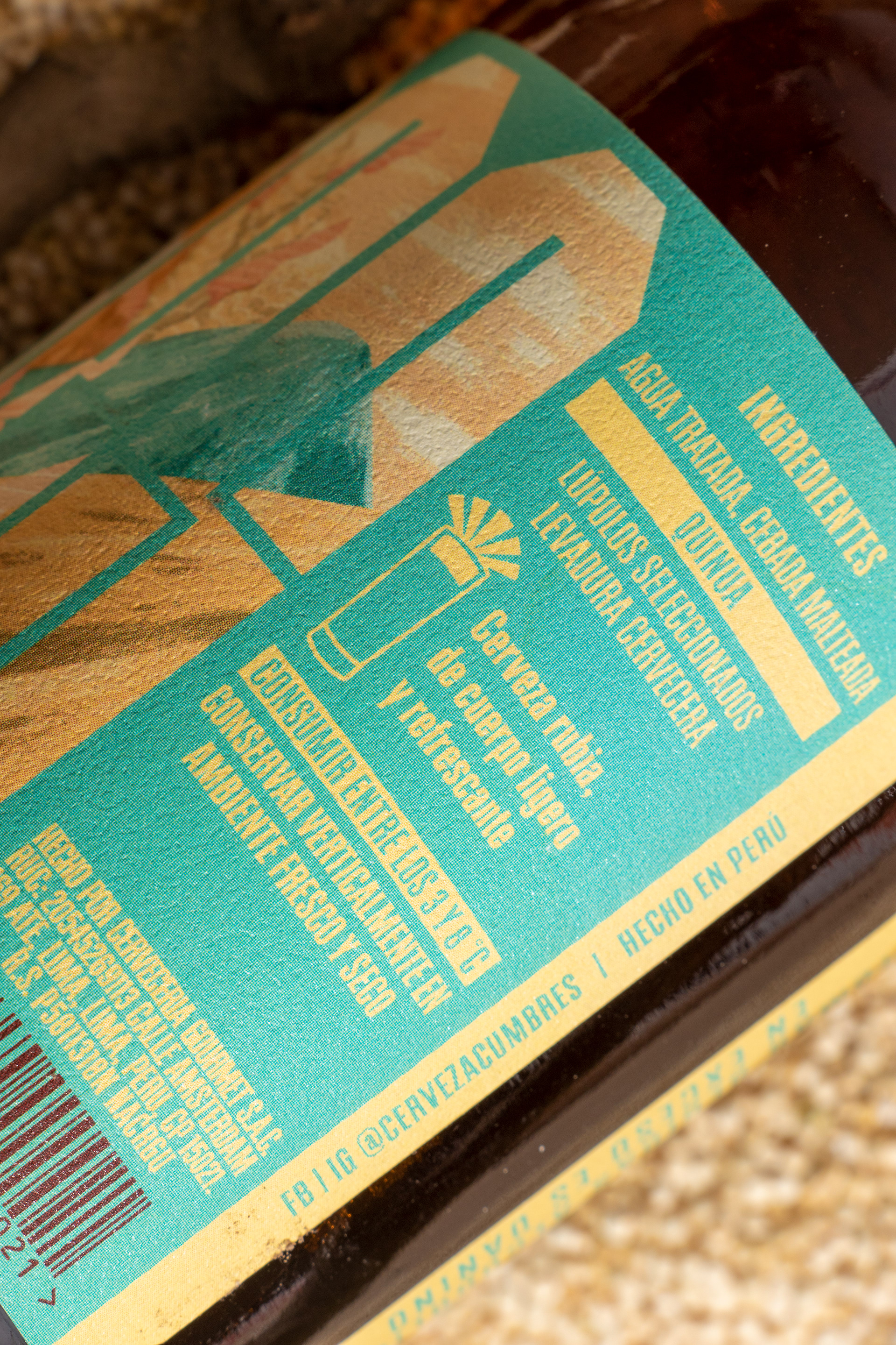
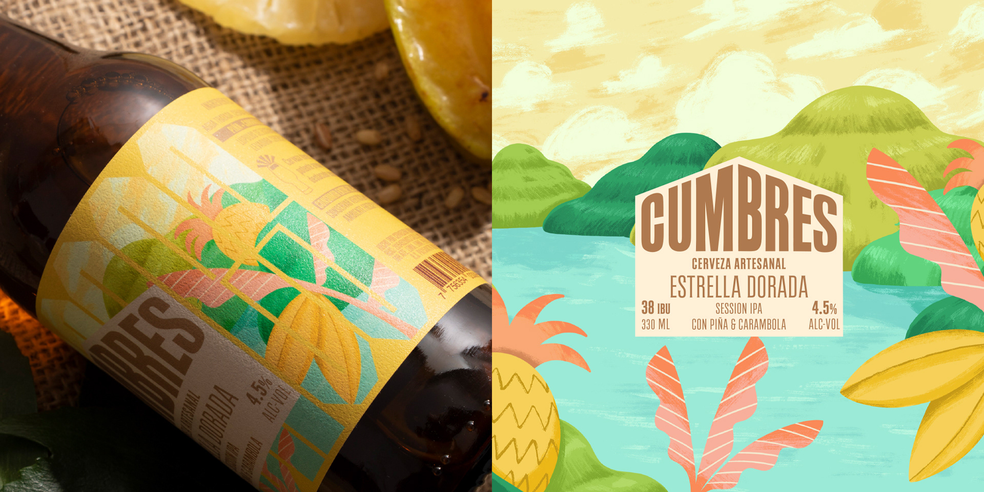
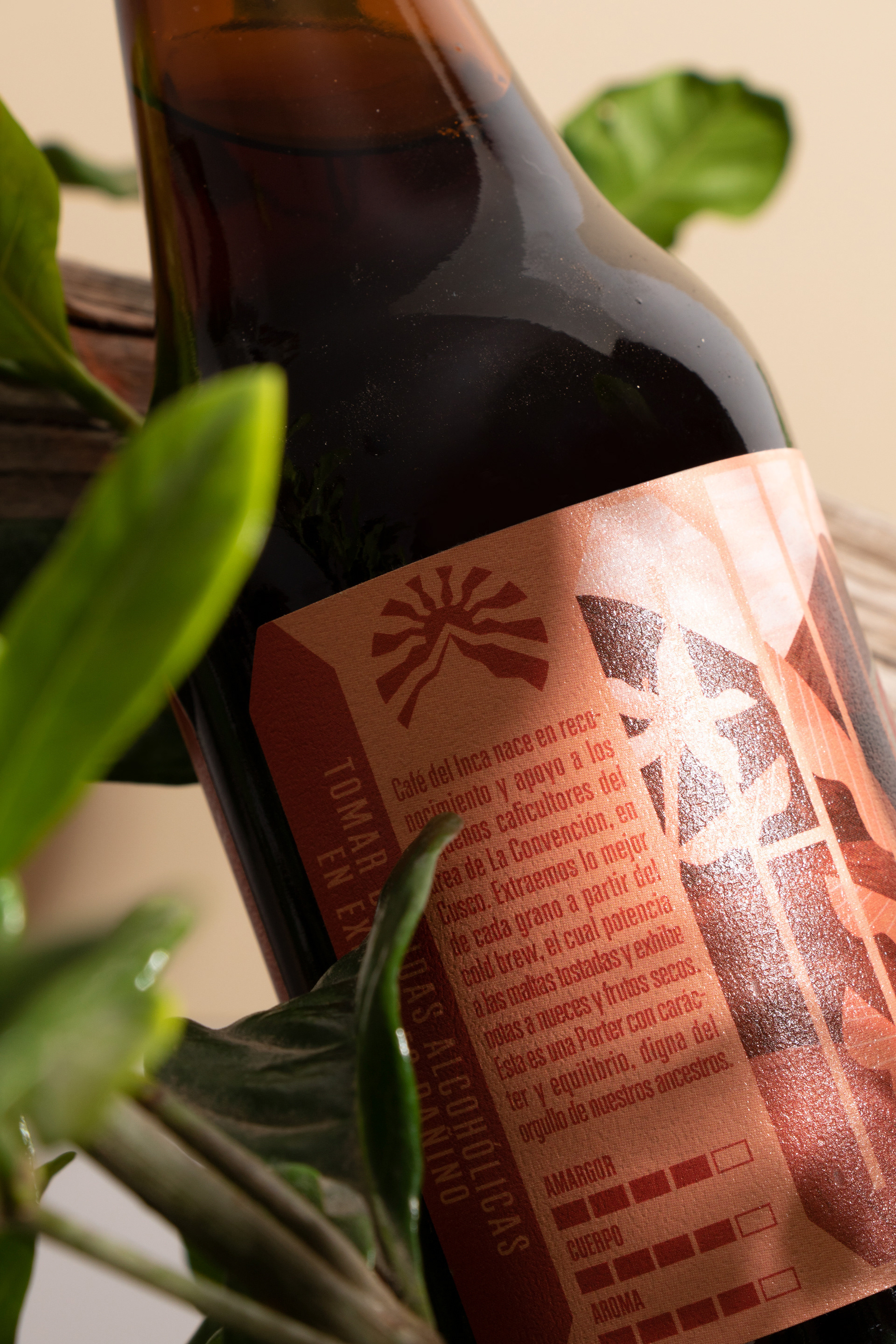
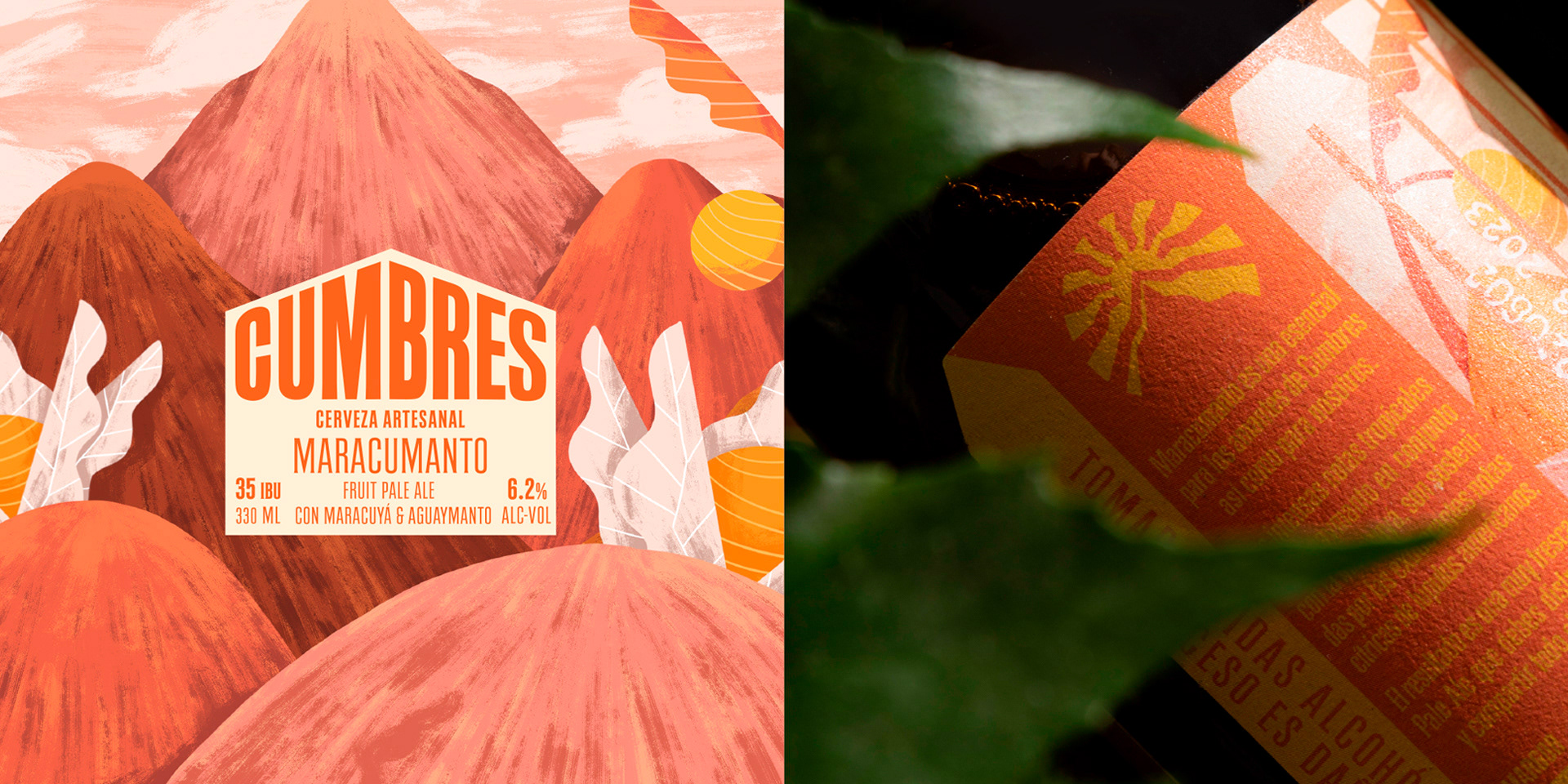
To support the creation of the visual identity system, we created a system of illustrations that represent both the ingredients that characterize each type of beer, usually a Peruvian ingredient, as well as the lands from which they come from; in addition, each illustration shows peaks, whether high snow-capped mountains or hills, but always present. Finally, these illustrations were conceived to be "seen" through a kind of lattice formed by the letters of the logo, as if they were windows; the intention of this lattice effect is to create the feeling that someone is observing nature but, in a way, not intervening in it: taking advantage of it, but leaving it intact, as it was found. A treasure.
FIBRA
BRANDING & PACKAGING @
@fibra_branding


STUDIO: FIBRA BRANDING
IG: @fibra_branding
CREATIVE & ART DIRECTION: Andrea Gálvez
GRAPHIC DESIGN: Daniela Barrio de Mendoza
ILLUSTRATION : Ricardo Bustamante
PHOTOGRAPHY: Daniela Barrio de Mendoza