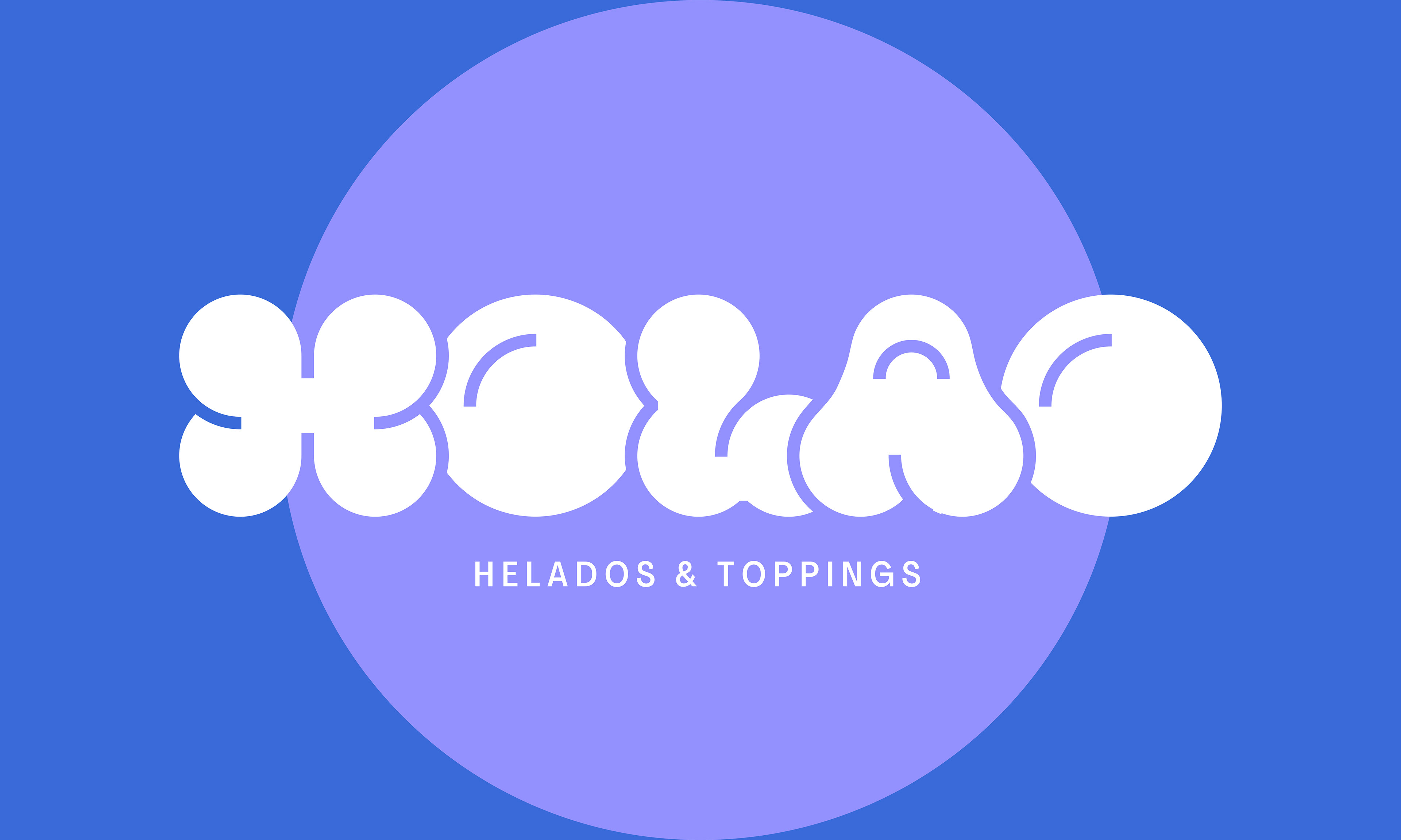
HOLAO!
Context:
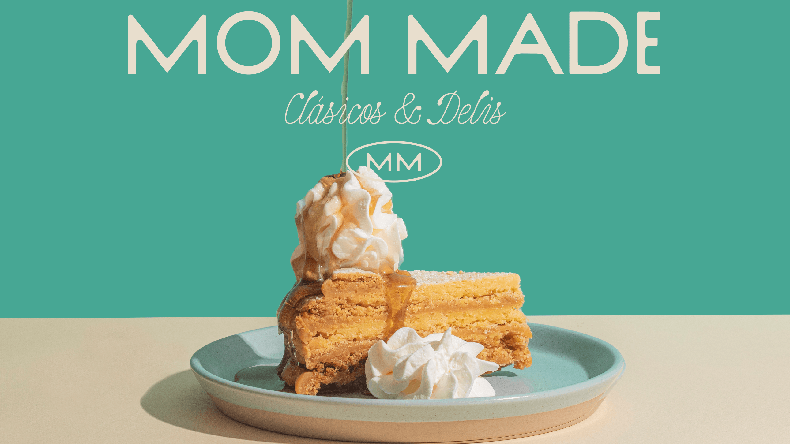
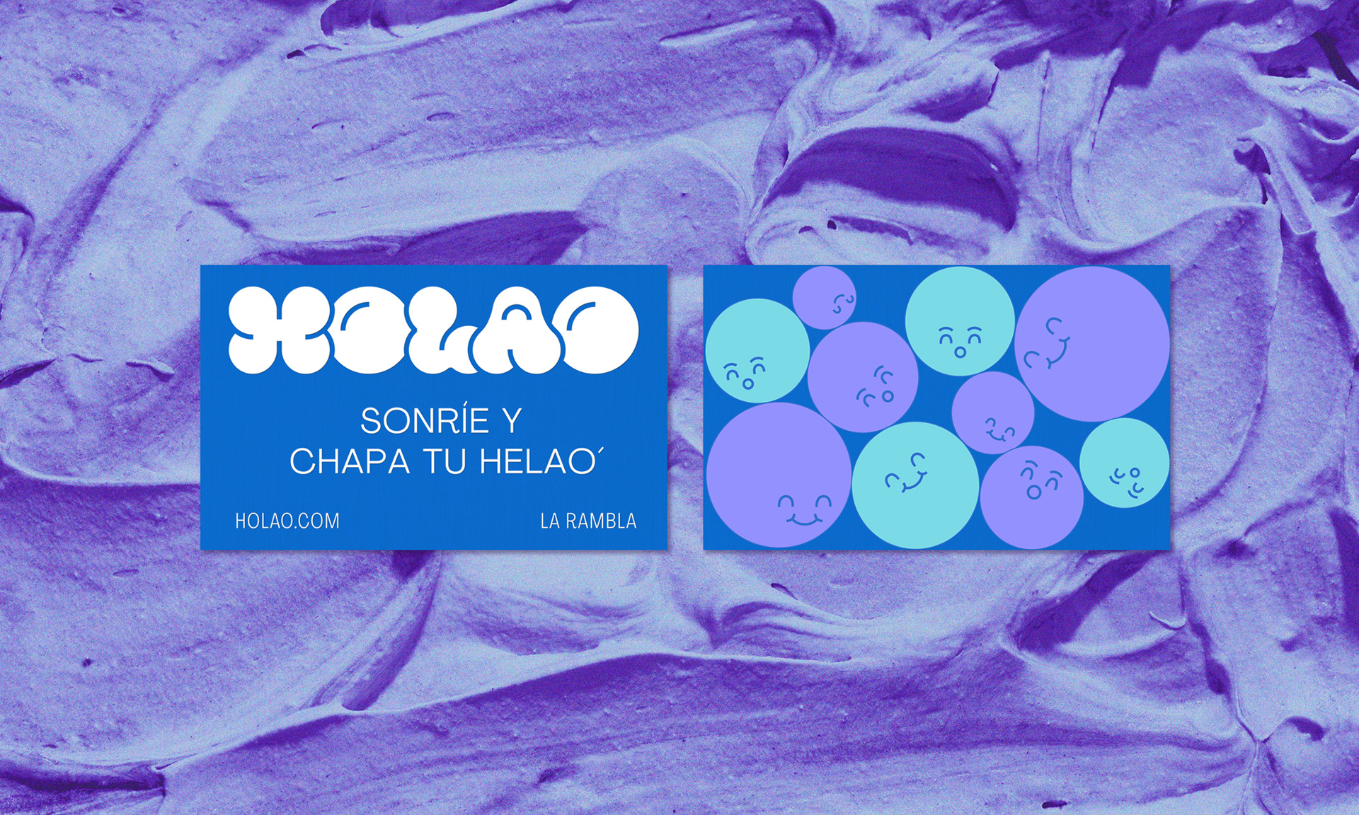
The context is purely commercial, it is about an ice cream brand with toppings, which is designed to operate within shopping centers to be consumed by their visitors. It is a brand that is born as the younger sister of Jump Spot, a children's playground for shopping centers, but will have to live alone in the near future.
Objective:
The objective was to develop the logo for the identity of a brand whose intention is to attract attention to generate an impulse purchase, for indulgence, where the brand is not the protagonist but the product, mainly the toppings, since the base ice creams are simple: either vanilla or chocolate.
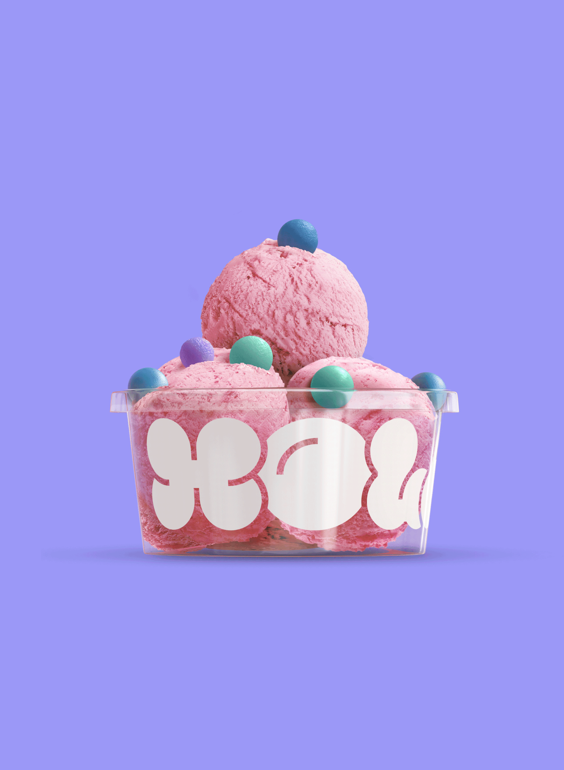
Solution:
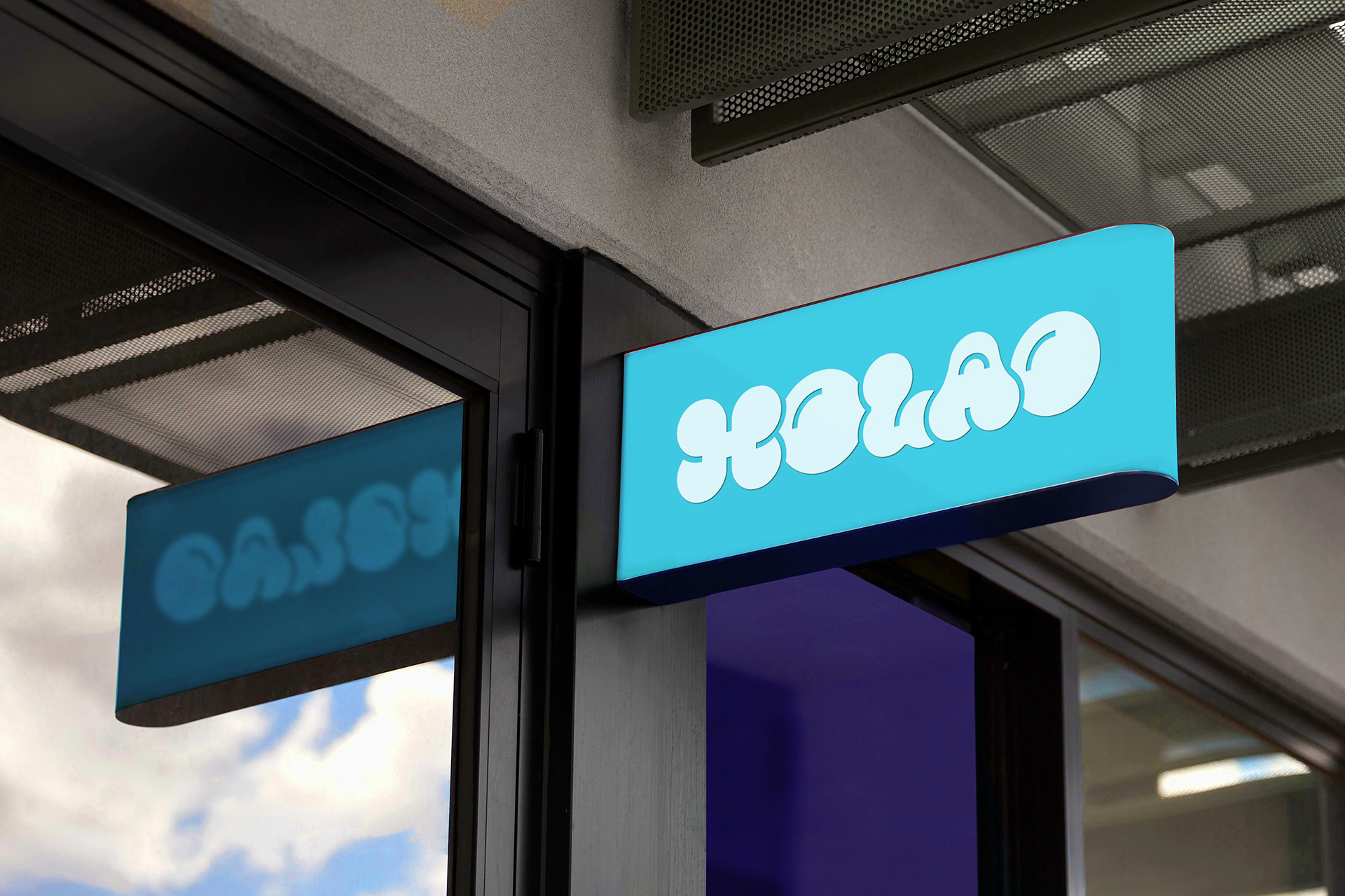
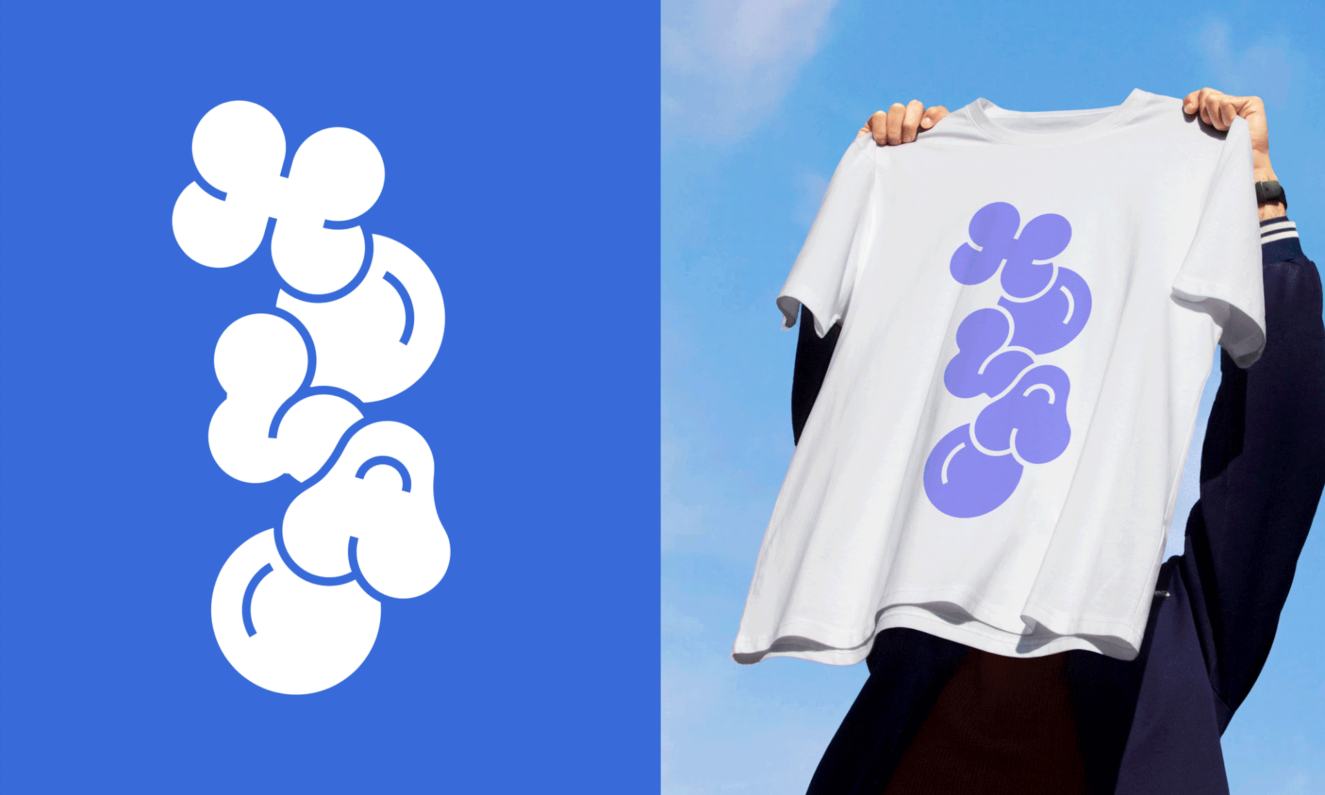
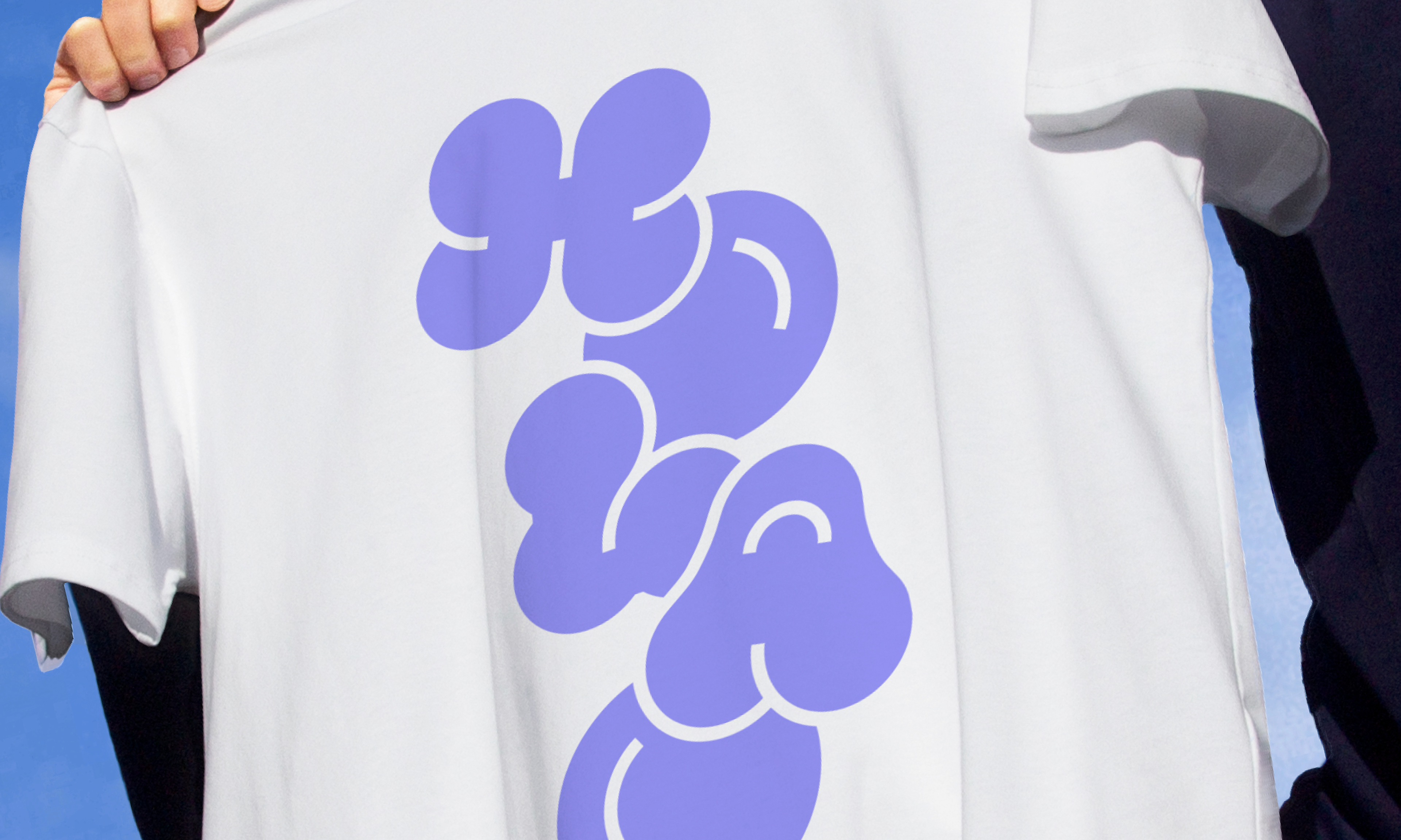
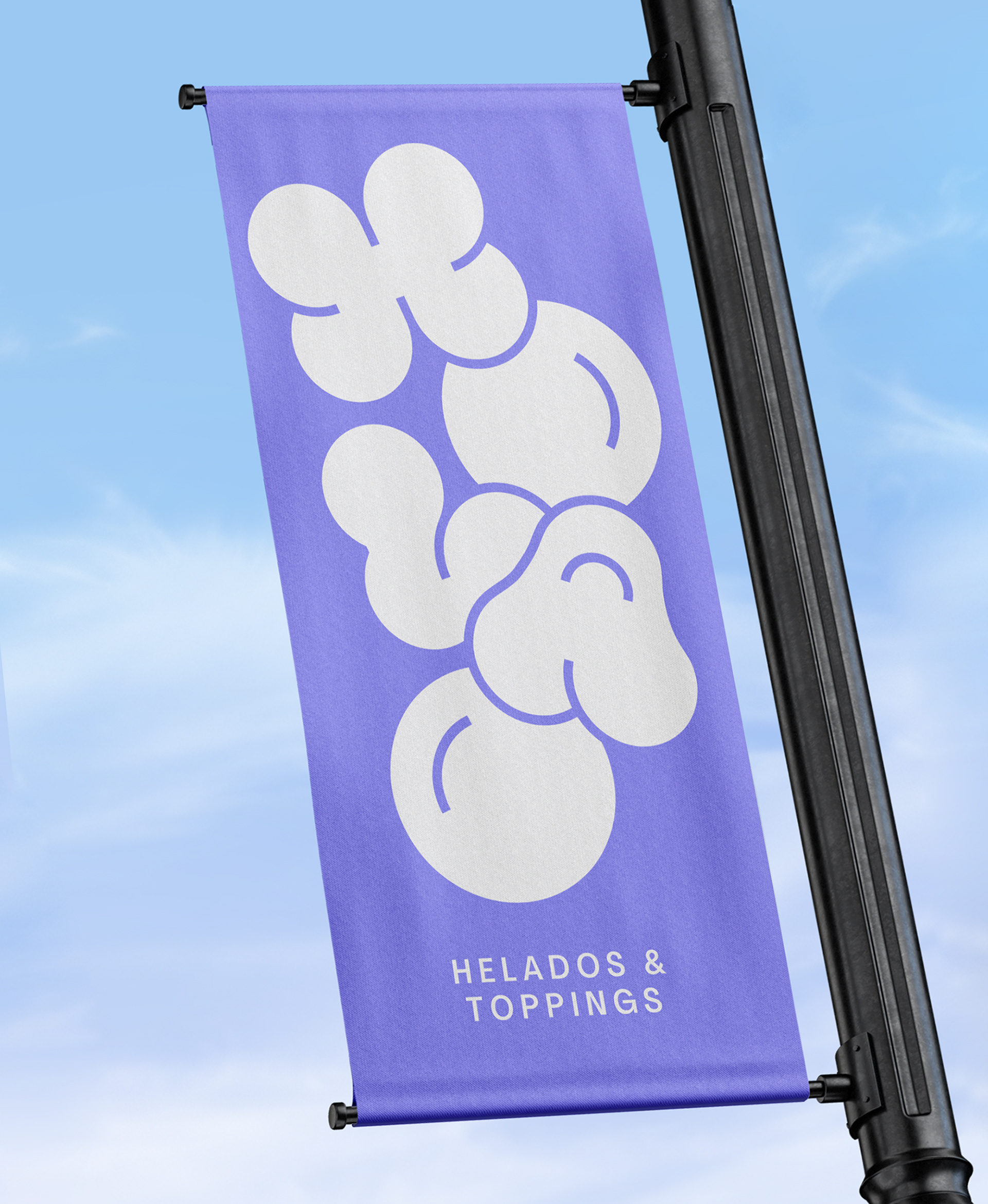
As the toppings are the protagonists, the logo is inspired by their most recurring shapes: spheres; that's why the rounded and fluffy shapes of the drawn typography. The logo is shown in various colors that represent both the sweetness and the coldness, main characteristics of ice cream.
FIBRA
BRANDING & PACKAGING @
@fibra_branding


STUDIO: FIBRA BRANDING
IG: @fibra_branding
CREATIVE & ART DIRECTION: Andrea Gálvez
GRAPHIC DESIGN: Daniela Barrio de Mendoza
ILLUSTRATION : Ricardo Bustamante